
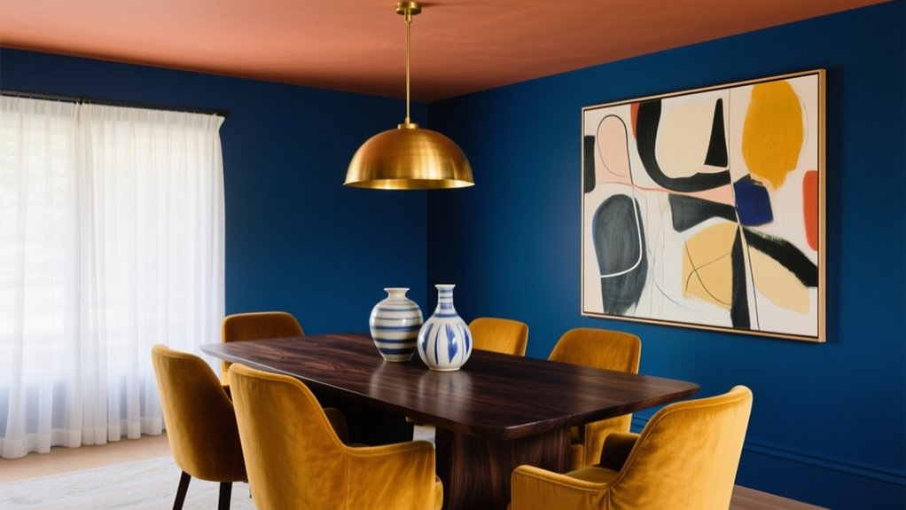

Transform your dining room fast by choosing a saturated jewel tone—emerald, sapphire, amethyst, or garnet—based on your light (north feels cooler, west intensifies at night). Use eggshell or satin to bounce light, then add warm-white trim and a lighter ceiling to keep the space lifted. Ground bold walls with beige, cream rugs, and warm woods, and repeat your “hero” colour in art or curtains. Next, you’ll see which wall and finish works best.
Key Takeaways
- Choose a single saturated jewel tone (emerald, sapphire, amethyst, garnet) for walls to create a tailored, transformative dining-room statement.
- Test large two-coat sample boards in north, south, east, and west light to confirm depth and undertones before committing.
- Use warm-white trim and a lighter ceiling to sharpen contrast, prevent visual shrinkage, and lift perceived room height.
- Pair bold walls with warm woods, beige, and cream textiles to ground saturation and keep the space rich yet livable.
- Reinforce the “hero” colour twice in art, rugs, or curtains, and add brass or mirrors to bounce light and unify the palette.
Choose a Bold Dining Room Palette for Your Light
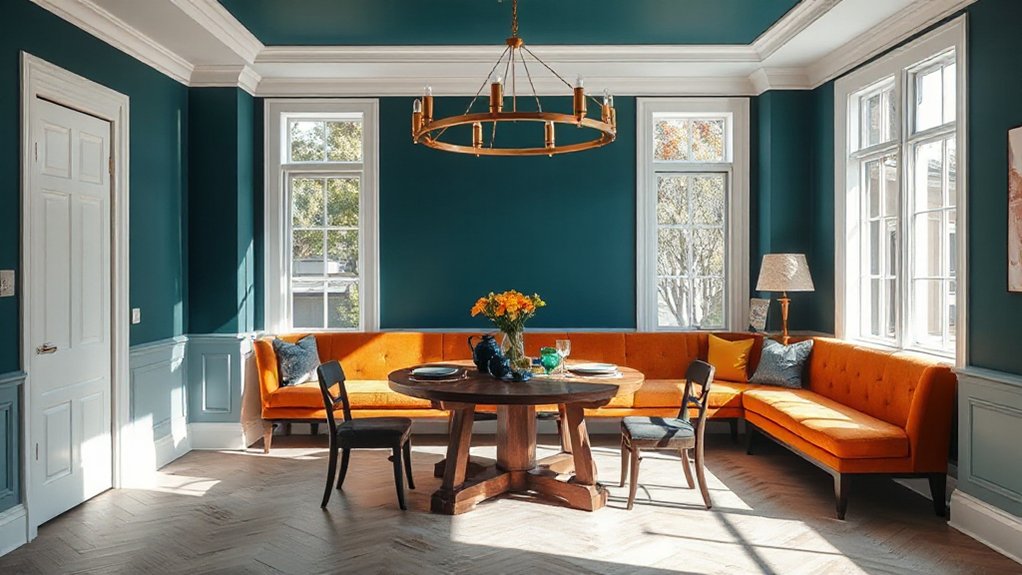
Before you commit to a saturated paint or statement wallpaper, read your dining room’s light like a designer would, because it determines whether bold colour looks rich or harsh. Check exposure first: north light runs cool, so you’ll want warmer undertones; south light runs bright, so cooler shades stay crisp. East light flatters breakfast, west light intensifies at night—test swatches in both. Use Color psychology to steer mood: energetic reds suit lively hosts, while inky blues signal calm formality. Balance contrast with trim and ceiling tones so the room doesn’t feel smaller than it is. Finally, choose finishes for paint durability: eggshell hides scuffs, satin wipes clean, and high-traffic walls need washable formulas.
Try Jewel-Tone Dining Room Walls (and Avoid Gloom)
Although jewel tones feel inherently dramatic, they don’t have to turn your dining room into a cave—if you handle depth, sheen, and contrast like a pro. Start by choosing one saturated family from Jewel tone palettes: emerald, sapphire, amethyst, or garnet, then commit across all walls for a tailored, enveloping look. Pick a finish that bounces light: eggshell or satin beats dead-flat, especially in north-facing rooms. For Gloom avoidance, layer crisp, high-contrast trim in warm white and keep the ceiling lighter to lift the visual height. Add reflective elements—brass, mirror frames, glazed ceramics—and use a rug or curtains with a light ground to break up density. Finally, swap bulbs to 2700–3000K so color reads rich, not muddy, at night.
Use One Bold Dining Room Accent Wall: Pick the Right Wall
Start by choosing the wall that already acts as your focal point—typically the one behind the sideboard, artwork, or main sightline from the entry. Check how daylight and sightlines move through the room so your bold colour amplifies brightness and flow instead of chopping the space up. Then balance the statement with your furnishings by keeping big pieces streamlined and letting texture and accessories echo the accent shade.
Identify The Focal Wall
One wall should do the heavy lifting: choose the dining room wall your eyes land on first, because that’s the one a bold colour will amplify best. Stand at the entry and scan naturally; the wall that anchors the table or frames a key feature is your winner.
Lock in smart focal wall placement by prioritizing structure over decoration: the wall behind a sideboard, the wall your table faces, or the wall that visually terminates the room. Keep adjacent walls quiet so the accent reads intentional, not chaotic. Use color psychology to match mood to function—deep greens and blues feel grounded and intimate, while saturated terracotta or ochre boosts warmth and appetite. If two walls compete, you haven’t found the focal yet.
Consider Light And Flow
Before you commit to a bold accent wall, read the room’s light and traffic patterns, because color shifts dramatically from morning glare to evening candlelight. Track your natural lighting for a full day: north light cools reds, west light amplifies warm tones, and overhead fixtures can flatten saturated hues. If the wall faces a window, expect higher contrast and consider a slightly deeper shade to prevent washout.
Now map room flow. Choose a wall you’ll see upon entry or when seated, not the one people constantly pass inches away. Avoid walls broken by multiple doors or busy openings, which chop color into fragments. If your dining room connects to a hallway, align the accent wall to guide sightlines rather than interrupt them. Paint samples vertically to mimic real coverage.
Balance With Furnishings
Because your accent wall becomes the room’s visual anchor, you’ve got to balance it against what already carries weight—your dining table, chairs, rug, and any large sideboard. Choose the wall that sits behind the most substantial piece so the colour reads intentional, not random, and avoid placing it opposite a busy gallery or open shelving. Aim for Furnishing harmony by matching undertones: warm walnut pairs best with earthy reds, ochres, and inky greens; cooler oak and chrome handle cobalt, charcoal, and crisp teal. Lock in Color coordination by repeating the wall colour in two small hits—seat cushions, a vase, or artwork. Keep the remaining walls quieter, and let texture (linen, cane, bouclé) add depth without competing.
Balance Bold Dining Room Colours With Warm Neutrals
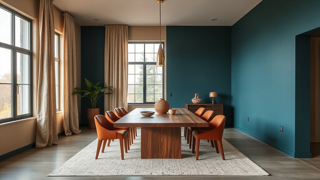
If you’re going bold with jewel tones, ground them with beige so the room feels rich, not loud. Bring in warm woods—think walnut or oak—to add natural balance and keep the palette current. Finish with layered cream textiles and a rug to soften the contrast and make the space feel inviting.
Pair Jewel Tones With Beige
While jewel tones bring instant drama to a dining room, beige keeps the look grounded and livable. Choose one saturated shade—emerald, sapphire, or amethyst—and let beige do the heavy lifting on larger surfaces like walls, drapery, or an area rug for reliable Color harmony.
Use jewel tones as deliberate accents: upholstered dining chairs, a painted sideboard, or oversized art. Then add Texture contrast to prevent the pairing from feeling flat—think bouclé seat pads against smooth lacquer, or matte ceramics beside glossy glass. Keep metal finishes consistent and warm-neutral leaning (brushed brass or soft black) so the palette reads intentional. If the room feels too intense, shift to a greige beige and soften lighting with dimmable bulbs.
Use Warm Woods For Balance
Even when you lean into bold dining room colours, warm wood brings instant balance and keeps the space feeling inviting. Choose oak, walnut, or teak to soften saturated walls like emerald, cobalt, or terracotta without muting their impact. If your palette runs cool, pick honey or caramel tones; if it runs warm, go for deeper espresso finishes to ground the room.
Anchor the look with a substantial dining table, then repeat the wood tone in chairs, picture frames, or a sideboard for cohesion. Mix finishes intentionally: matte wood against glossy paint reads current and polished. For Rustic charm, use visible grain and slightly weathered surfaces; for Modern elegance, keep silhouettes clean, edges crisp, and hardware minimal. Add warm lighting to highlight the wood’s depth.
Layer Cream Textiles And Rugs
When bold dining room colours take over the walls or cabinetry, cream textiles and rugs step in as the warm neutral layer that keeps everything feeling polished, not loud. Start with upholstered dining chairs in performance linen or boucle to soften saturated paint and add quiet depth through Textile textures.
Anchor the space with a large cream-toned rug that reaches beyond chair legs, so the room reads intentional even when seats slide out. Choose Rug patterns that echo your palette: тонal stripes for modern schemes, subtle vintage medallions for maximal colour, or a tight geometric to sharpen high-contrast looks. Layer in a cream table runner, napkins, and curtains to diffuse glare and balance glossy finishes. Keep undertones consistent—ivory with warm colours, cooler ecru with crisp blues—and you’ll get cohesion without muting the drama.
Add Bold Colour With Dining Chairs and a Statement Table
If you want maximum impact with minimal effort, start by injecting bold colour through your dining chairs and anchoring the room with a statement table. Choose chairs in saturated tones—cobalt, oxblood, emerald, or sunflower—then keep the tabletop grounded in walnut, blackened oak, stone, or a high-gloss lacquer for contrast. For smart color coordination, repeat your chair hue in a small accent: a runner, art, or a single ceramic piece, not the whole room. Prioritise furniture placement: centre the table on the rug, maintain clear walkways, and pull chairs far enough from walls so colour reads from every angle. Mix finishes thoughtfully—matte chairs with a reflective table—or flip it for a sharper, modern edge.
Echo Your Palette With Colourful Lighting and Shades
Because lighting sits at eye level and overhead, it’s one of the fastest ways to echo your dining palette without repainting a single wall. Swap in coloured glass pendants, lacquered metal shades, or a fabric drum in your accent hue to repeat what you’ve already introduced at the table. Treat ambient illumination as a design tool: warm-toned bulbs enrich reds, terracottas, and brass, while cooler temperatures sharpen blues, greens, and chrome. Use colour psychology to steer the mood—amber reads convivial, emerald feels grounded, and blush stays flattering on skin. Keep it cohesive by matching undertones and finish levels. Aim for:
- One dominant shade colour
- One supporting metal finish
- Dimmable control for flexible brightness
Layer Bold Colour With Art, Rugs, and Curtains

To make a bold dining-room palette feel intentional rather than loud, layer it through art, rugs, and curtains in controlled doses. Start with one “hero” colour, then repeat it twice elsewhere so your eye reads cohesion, not clutter—an approach grounded in Color psychology.
Use art as your colour anchor: choose a piece that carries your dominant hue plus one supporting tone, then echo those shades in a rug border or curtain trim. Prioritise art placement: hang works at eye level when seated, and keep the frame finish consistent with your hardware. Pick a rug that’s slightly more muted than the walls to prevent visual vibration, and let curtains add vertical colour blocks that elongate the room. Balance saturation with neutrals in tabletop linens and chairs.
Test Bold Dining Room Paint With Samples First
Once you’ve echoed your hero colour through art, rugs, and curtains, lock in the biggest visual commitment: the paint on your dining-room walls. Don’t gamble on a tiny swatch; order sample pots and paint large boards you can move around the room. Check them morning, afternoon, and under candlelight—bold hues shift fast with warm bulbs and reflective tableware. Use the Color wheel to confirm undertones so your “emerald” doesn’t read teal beside oak or brass.
- Paint two coats on A3 boards, and wrap edges to mimic corners
- Compare at eye level against trim, upholstery, and your ceiling colour
- Test paint finishes: matte hides flaws, eggshell wipes clean, satin amplifies sheen
Commit only after a 48-hour look.
Frequently Asked Questions
How Do Bold Dining Room Colours Affect Home Resale Value?
Bold dining room colours can boost resale if you’ve used Color psychology and kept Interior coordination tight; they’ll hurt value if buyers see rework. You’ll win with trendy, balanced hues and easy repaint options.
What Paint Finishes Work Best for High-Traffic Dining Rooms?
Pick practical, polished paint finishes: satin or semi-gloss. You’ll get a wipeable paint sheen and stronger color durability against scuffs and spills. Use eggshell only on low-wear walls, and choose scrubbable formulas.
How Do I Choose Bold Colours That Complement Adjoining Rooms?
Choose bold colours by matching undertones in adjoining rooms and repeating one accent for color coordination. You’ll boost mood enhancement by balancing saturation with shared neutrals. Test large swatches in doorway light, then commit confidently.
Are Bold Colours Safe for Renters Using Removable Paint Options?
Yes—bold colours can be your safety net if you use removable paint options. Choose renter friendly colour palettes like deep teal or terracotta, test a patch, prep walls well, and keep documentation for move-out.
Which Bold Colours Hide Stains and Scuffs Most Effectively?
You’ll hide stains and scuffs best with deep charcoal, navy, forest green, and rich oxblood. Pair them with stain resistant finishes. Use color matching techniques for touch-ups, and choose satin/eggshell sheens to mask wear.
Conclusion
When you choose bold dining room colour, you’re not gambling—you’re directing the light, mood, and focus. Start with your room’s exposure, commit to one hero wall or jewel-toned wrap, then soften it with warm neutrals and natural textures. Picture a north-facing space: you paint the side wall deep emerald, add camel linen drapes, oak table, and rust velvet chairs. Finish with a brass pendant and patterned rug, and test samples first.