
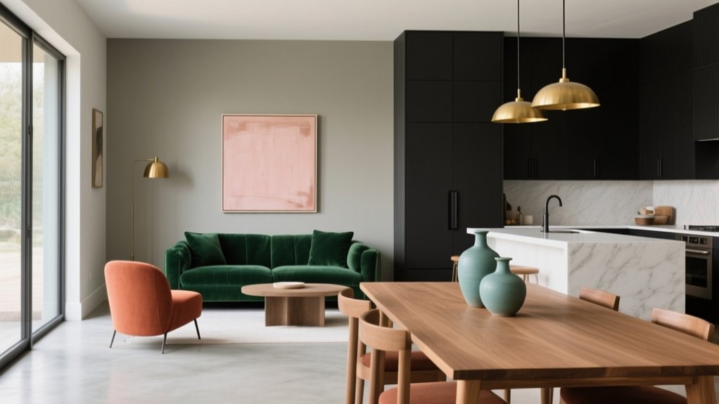

For a contemporary open-plan scheme, you’ll get cohesion by starting with warm, undertone-matched neutrals, then zoning with two-tone walls and a calm tone-on-tone palette. Add bold accents on anchored surfaces like a media wall or island, and use light–dark contrast to define dining or seating zones without closing the space in. Bring in earthy greens or inky blues sparingly, and vary finishes—matte, satin, limewash—for layered depth. Next, you’ll see how to apply each idea cleanly.
Key Takeaways
- Use warm layered neutrals (greige, pink-beige, honey) across floors, walls, and cabinetry to keep open-plan areas cohesive and calm.
- Zone without walls using two-tone paint: darker lower bands anchor dining or kitchen areas while lighter uppers preserve spaciousness.
- Create contemporary flow with tone-on-tone colour blocking, varying one hue across zones and using different finishes for depth and interest.
- Add wayfinding with bold accents on anchored surfaces (islands, media walls, joinery) and repeat the accent twice in textiles or decor.
- Balance contrast with earthy dark anchors (charcoal, navy, olive) against light neutrals, and test large swatches in day and night lighting.
Warm Neutrals for Open-Plan Flow (And How to Choose)
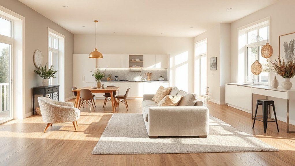
If you want your open-plan layout to feel cohesive without looking flat, start with warm neutrals—they smooth the shift between kitchen, dining, and living zones while keeping the space bright and current. Choose an undertone first: pick pink-beige, honey, or greige by matching fixed finishes like flooring, stone, and cabinetry. Test large swatches across zones at morning and evening; warm paints can turn peachy under LEDs and muddy in north light. Build depth with Textured neutrals—limewash, microcement, woven rugs, and bouclé—so the palette reads layered, not bland. Then tighten the edit with Complementary colour schemes in small doses: brass, walnut, olive, or inky black hardware and lighting. Keep trims and ceilings slightly lighter for lift.
Use Two-Tone Walls to Zone Each Area
Because open-plan rooms rarely come with natural stopping points, two-tone walls let you create clear zones without breaking the layout’s flow. Paint the lower portion deeper to anchor a dining area, then keep the upper portion lighter to lift the ceiling line and maintain openness. Use a crisp horizontal split, or follow architectural cues like dado rails, window heads, or the back of built-ins for a tailored edge.
Nail the Color pairing by matching undertones: warm clay with creamy off-white, or inky navy with chalky grey for a modern, graphic read. Reinforce boundaries with Wall textures—matte below for durability, soft eggshell above for wipeability, or limewash on one band for subtle movement. Repeat the darker shade in soft furnishings to lock the zone in.
Go Tone-on-Tone for a Calm, Cohesive Look
While bold contrasts can energise an open-plan layout, tone-on-tone colour delivers a quieter kind of definition that still feels intentional. You’ll create monochrome harmony by selecting one base hue and then shifting value and undertone across zones—think warm greige on main walls, a deeper mushroom on built-ins, and a pale stone on trim.Tonal layering works best when you vary finish as well as shade: matte walls reduce glare, satin cabinetry adds polish, and textured plaster or limewash brings movement without visual noise. Keep ceilings a step lighter to lift the volume, and repeat your key tone in large elements—sofas, rugs, and drapery—to lock the palette together. If daylight changes across the plan, test swatches in each area before committing.
Bold Accent Colours: Where to Add Them
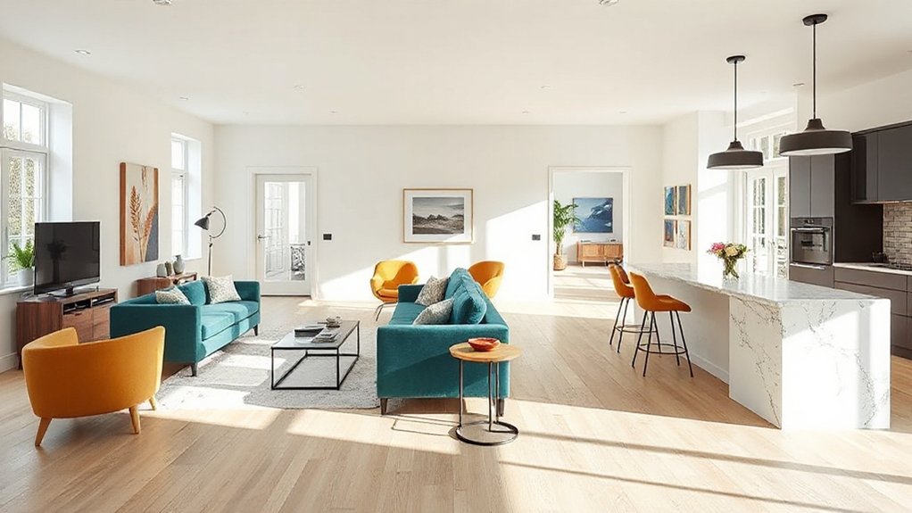
Even in a restrained open-plan palette, a bold accent colour can act like visual wayfinding, signalling where one zone ends and the next begins. Start with an anchored surface: behind the sofa, on the dining banquette, or around a built-in media wall—smart Accent wall ideas that won’t overwhelm. If you’d rather keep walls quiet, push colour onto joinery: kitchen island panels, a drinks cabinet, or open shelving backboards. Use statement furniture highlights to punctuate sightlines—an upholstered counter stool, a sculptural armchair, or lacquered side tables. Repeat the accent twice more in small, intentional hits (artwork, a runner, ceramics) so it reads designed, not random. Keep the finish consistent: matte for modern calm, gloss for sharp, gallery-like impact.
Light–Dark Contrast for Modern Open-Plan Spaces
In modern open-plan spaces, you can zone without walls by pairing crisp light surfaces with strategically placed dark anchors. You’ll get the clean, contemporary look by keeping bold accent colours tight and intentional—think one statement piece or a single feature plane per zone. Ground the whole layout with a dark base (flooring, cabinetry, or a low-level band) so the contrast reads cohesive, not chaotic.
Zoning With Contrast
Because open-plan layouts can blur how each area should function, you can use light–dark contrast to zone the space without adding walls. Start by setting one “anchor” zone in a deeper tone—think a charcoal dining niche or inky built-in—then keep adjacent circulation and seating in lighter neutrals to maintain flow. Control the shift with crisp paint breaks, half-height colour blocks, or a darker ceiling over the task area to visually lower it.
Use texture pairing to prevent the contrast from reading flat: matte walls against oak grain, brushed metal, or boucle upholstery. Plan lighting effects carefully—warm pendants over dark zones, brighter ambient light in pale areas—so edges feel intentional, not abrupt. Keep undertones consistent for cohesion throughout.
Bold Accents, Dark Bases
Once you’ve defined zones with light–dark contrast, you can push the look further by grounding the whole open plan in a dark base and punctuating it with bold, high-impact accents. Choose charcoal, inky navy, or deep olive for key anchors—kitchen cabinetry, a media wall, or built-ins—so sightlines feel cohesive, not busy.
Then layer confident colour in controlled doses: a saffron island stool, cobalt pendants, or a vermilion lounge chair. You’ll get Vibrant palettes without visual noise if you repeat each accent at least twice across the plan. Add Artistic patterns through a graphic runner, tiled splashback, or oversized artwork, but keep the background matte and low-contrast. Finish with warm metals and textured woods to stop the scheme feeling cold or flat.
Earthy Greens and Blues That Still Feel Open
To keep an open-plan layout feeling airy while adding depth, you can lean on earthy greens and blues with a muted, greyed-off base. Pair muted sage with soft teal to define zones without harsh edges, or use olive and dusty blue to ground the space while letting light bounce cleanly across walls and cabinetry. Stick to matte or eggshell finishes and repeat the undertone across textiles and accents so the palette reads cohesive, not heavy.
Muted Sage And Teal
Two shades can shift an open-plan layout from stark to grounded without making it feel closed in: muted sage and soft teal. Use muted sage on the largest planes—walls, kitchen cabinetry, or built-ins—so the space reads calm and continuous, not chopped up. For a reliable Muted sage pairing, keep ceilings and trims warm white and layer pale oak, linen, and brushed brass to maintain lift.
Bring in teal accents where you want definition: bar stools, a runner, artwork, or powder-coated pendant shades. Keep teal to a controlled 10–20% of the palette, and repeat it in at least three spots to create flow across zones. Choose matte or eggshell finishes to soften glare and keep sightlines airy.
Olive And Dusty Blue
Muted sage and teal set a calm baseline, but olive and dusty blue give your open-plan space a richer, more architectural feel while still reading light and breathable. Use olive on lower cabinetry, an island base, or built-ins to ground sightlines without shrinking the footprint. Bring dusty blue through a sectional, drapery, or a large rug to cool the warmth and keep the volume airy.
From a Color psychology standpoint, olive signals stability and nature, while dusty blue supports focus and calm—ideal for kitchen-living hybrids. For furniture coordination, pair these tones with oak, walnut, brushed brass, and matte black. Keep walls warm white, then repeat each colour in small accents to stitch zones together without hard visual breaks.
One Colour Throughout, Varied Finishes for Depth
Even if you stick to one colour across an open-plan layout, you can still build real dimension by layering finishes that catch light differently. Aim for monochromatic harmony, then rely on finish layering to separate zones without chopping up flow.
Use matt paint on broad walls to calm glare, then shift to eggshell on trim for a clean outline. Add a satin or lacquered cabinetry run to bounce daylight through the kitchen, and balance it with a textured plaster or limewash on the dining wall for soft movement. Ground the living area with a velvet sofa, boucle chairs, or a ribbed rug in the same hue. Finally, specify mixed metals—brushed nickel, aged brass—so reflections feel intentional, not busy.
Frequently Asked Questions
What Paint Sheen Works Best in High-Traffic Open-Plan Areas?
You’ll get the best results with satin or eggshell in high-traffic areas; they balance washability and a modern look. For paint durability, pick scrubbable formulas. In sheen comparison, avoid flat; use semi-gloss on trim.
How Do I Coordinate Wall Colours With Existing Flooring and Cabinetry?
Pair your flooring’s undertone with cabinetry’s warmth—cool meets cozy—and choose walls one step lighter for Color harmony. Then repeat finishes in decor accents: textiles, metals, art. You’ll balance contrast and cohesion, effortlessly.
Which Colours Make an Open-Plan Space Feel Warmer in Winter?
You’ll warm an open-plan space in winter with Seasonal colour palettes like creamy ivory, greige, and soft terracotta. Add Warm accent tones—rust, ochre, cognac leather, and brushed brass—through textiles, artwork, and lighting.
How Can I Test Paint Colours Accurately Under Different Lighting Conditions?
Like a camera test shot, you’ll sample colours on large boards and move them room-to-room. Check Color temperature at dawn, noon, dusk, and under bulbs; note Natural lighting shifts, then choose the most consistent.
What Are the Best Low-Voc or Odour-Free Paint Options for Open-Plan Living?
Choose premium water-based acrylics labeled zero-VOC and low-odour; you’ll get fast cure and minimal off-gassing. Prioritize Eco friendly finishes and certified allergen free paints, then verify GreenGuard Gold or EU Ecolabel compliance.
Conclusion
When you treat colour as a zoning tool, your open-plan space feels intentional, not chaotic. Start with warm neutrals to keep flow, then layer tone-on-tone and controlled light–dark contrast for definition. Add one bold accent only where you want energy—often the dining wall or kitchen island. For example, in a 1930s semi, you’d run soft clay through the walls, then switch to matte olive cabinetry and a satin navy banquette to anchor each zone.