


To get a clean, modern monochrome scheme, you start with one base hue that suits the mood and matches fixed finishes, then you layer tints, tones, and shades for depth. You keep a clear value range—light on walls, mid on upholstery, dark on floors or millwork—so it won’t fall flat. You add interest with texture (linen, bouclé, fluted wood) and smart finishes: matte walls, satin trim, gloss accents. Keep art minimal, and there’s more to refine.
Key Takeaways
- Choose one base hue that matches the mood and fixed elements, then commit to it for a cohesive, modern look.
- Layer tints, tones, and shades of the same hue to create depth without adding extra colors.
- Use a clear light–mid–dark value plan, placing darker tones to ground the room and lighter tones to keep it airy.
- Add visual interest through texture and finish variety—matte walls, satin trim, and small gloss accents for crisp contrast.
- Warm monochrome spaces with natural materials like oak, linen, stone, and rattan, repeated in small doses to stay clean.
How to Build a Monochrome Colour Scheme (Step by Step)
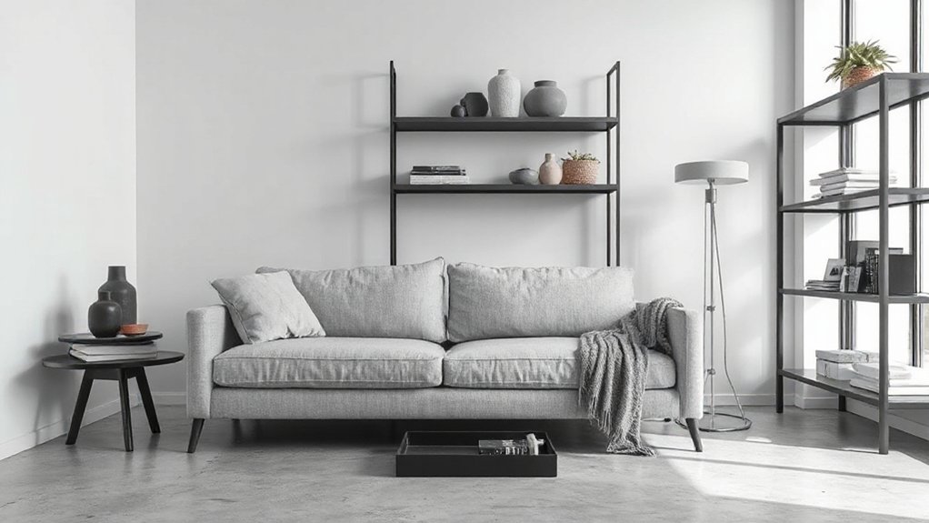
If you want a monochrome scheme that feels intentional—not flat—start with one base colour you genuinely like, then build out from it by choosing lighter tints, deeper shades, and a couple of muted tones to create contrast and depth without leaving the same hue family. Next, map your values: pick one light, one mid, and one dark, then assign them to ceiling/trim, walls, and anchoring pieces. Add a soft “bridge” tone for textiles so gradients don’t look harsh. Use Color psychology to set the mood: cooler values read calm, warmer ones feel social. Check Historical trends for cues—powdery pastels, inky moderns—then update with matte walls and subtle sheen shifts on woodwork. Finish with black or brass accents for crisp definition.
Choose a Base Hue for Your Monochrome Palette
A strong monochrome scheme starts with the hue you choose as your anchor, because every tint, shade, and muted variation will echo it. Begin by defining the mood you want the room to project, then use Color psychology to narrow your options: blue reads calm and tech-forward, green feels restorative, beige signals quiet luxury, and charcoal lands sleek and architectural.
Next, check your fixed elements—flooring, stone, large upholstery—and pick a hue that harmonises rather than fights. Factor in Cultural influences, too: white can feel crisp and minimal in one context, but ceremonial or stark in another; red may read festive, bold, or taboo. Test your base hue in the actual light at morning and night, and commit to one clear undertone.
Use Tints, Tones, and Shades to Add Depth
Once you’ve locked in your base hue, build dimension by layering its tints (hue + white), tones (hue + grey), and shades (hue + black) across the room. Paint walls in a soft tint, upholster key seating in a mid-tone, then ground the scheme with shade accents like matte hardware, frames, or a rug border.
Keep each step intentional: tints read airy and optimistic in Color psychology, while deeper shades feel protective and luxe. Use tones to bridge materials—think plaster, bouclé, brushed metal—so everything looks curated, not matchy. Let Cultural symbolism guide emphasis too; for example, red tints can signal celebration in many contexts, while deeper reds suggest tradition and authority. Test swatches under your actual lighting before committing.
Balance Light and Dark so It Doesn’t Feel Flat

Where does monochrome most often fall flat? When your light and dark values sit too close together, everything blends into one quiet block. You’ll fix it by mapping a clear value range first: pick a dominant mid tone, then assign lighter areas for openness and darker areas for grounding. Use Color psychology to guide placement—lighter values feel airy and optimistic, deeper values read calm, serious, and secure—so the room’s mood stays intentional. Pay attention to cultural symbolism, too: certain hues carry different “weights” across cultures, so test how your chosen colour reads in your context. Build contrast through placement, not extra colours: ceilings, floors, large upholstery, and drapery can anchor or lift the scheme without breaking the monochrome look.
When to Add Black or White for Punch
If your monochrome room looks polished but still lacks energy, add black or white only when you need a crisp edge or a clean pause in the palette. Use Black accents like a fine outline: they sharpen silhouettes, ground airy schemes, and make key pieces feel intentional. Lean on White backgrounds to reset the eye and keep your tone-on-tone layers looking fresh, not muddy.
Add punch when you’re trying to:
- Frame architectural lines (windows, trim, shelving)
- Highlight a focal point (art, headboard, console)
- Clarify zones in open plans (dining vs lounging)
- Control visual noise (cords, vents, radiator covers)
Keep it edited: repeat the black or white twice, then stop. That restraint reads modern and curated.
Add Contrast With Texture, Not Extra Colours
Even when you stick to a single hue, you can build real contrast by mixing textures instead of adding new colours. Pair smooth painted walls with nubby linen, bouclé, or a looped wool rug to create instant depth that still reads minimalist. Bring in ribbed glass, fluted wood, or cane to catch light differently and keep the palette calm.
Use Textural contrast to separate zones: a soft upholstered sofa against a crisp stone, plaster, or concrete surface makes each element feel intentional. Vary scale too—tight weaves next to chunky knits—so the room doesn’t flatten out. If the space feels dull, adjust Color saturation within the same family: dusty tones beside richer versions add body without breaking the monochrome look.
Pick Finishes: Matte, Satin, Gloss (What Each Does)

In a monochrome scheme, your finish choices do as much work as your colour. Matte reads calm and velvety, while satin adds a soft, light-catching lift that keeps walls looking polished. Bring in gloss sparingly on trim, cabinetry, or accents when you want crisp, modern contrast without introducing another shade.
Matte Vs. Satin Effects
Use finish to assign roles:
- Matte on broad walls to keep the field quiet
- Satin on trim and doors for crisp separation
- Matte on ceilings to reduce shadow banding
- Satin in hallways and kids’ rooms for wipeable durability
Test both on large swatches; evening lamps change the read dramatically.
Gloss For Modern Contrast
Where should gloss live in a monochrome scheme without turning the room into a mirror? Use it as an accent, not a blanket. In modern spaces, gloss works best on trim, doors, cabinetry, and built-ins where light can skim and define edges. That targeted Gloss enhancement sharpens lines and adds Modern contrast against matte walls or ceilings.
Keep your main planes matte to hide imperfections and calm glare. Choose satin for high-touch surfaces like hall walls or kids’ rooms; it cleans easily but doesn’t shout. Then reserve full gloss for small, intentional hits: a black credenza, lacquered nightstand, or a painted banister. Pair gloss with softer textures—linen, wool, ribbed tile—to keep the palette crisp, not clinical.
Warm a Monochrome Scheme With Natural Materials
Once you’ve nailed your matte, satin, and gloss balance, warm your monochrome scheme with natural materials that add quiet texture. Layer light or smoked wood with rattan to soften the look without breaking the palette. Finish with linen upholstery and stone accents to bring in breathable warmth and grounded contrast.
Layer Wood And Rattan
How do you keep a monochrome room from feeling flat? You layer wood and rattan to add warmth without breaking your palette. Choose pale oak, walnut, or ebonized finishes that echo your blacks, whites, and greys, then offset them with woven pieces that soften hard edges. Natural textures read as tonal variation, so your scheme stays clean yet lived-in. Stick to a few repeat materials and scale them up for a modern, intentional look.
- Use a slatted wood bench as a grounding “mid-tone” anchor
- Add a rattan pendant or chair to introduce airy pattern
- Mix matte and satin wood finishes for depth, not clutter
- Repeat organic materials in small accents to keep cohesion
Add Linen And Stone
Wood and rattan bring warmth through grain and weave; linen and stone do the same with soft touch and cool weight. If your monochrome room feels flat, introduce Linen textures in curtains, slipcovers, or a relaxed duvet to soften hard lines without adding colour. Keep the palette tight—ivory, oat, putty, and warm grey—so everything still reads modern.
Use Stone accents to ground the look: a travertine side table, honed marble tray, or a limestone-look lamp base. Mix finishes intentionally—matte linen against polished stone, or slubby linen with brushed, chalky surfaces. Stick to large, simple shapes and let texture do the styling. Add one tactile throw and one stone piece per zone, and you’ll get depth, calm, and an elevated, minimalist feel.
Monochrome Colour Scheme Ideas by Room
Where should you start with a monochrome scheme if you want it to feel intentional, not flat? Begin room by room, using Color psychology to set mood and Cultural influences to guide your references, from Nordic calm to Japanese restraint. Pick one base tone, then layer finishes so the space reads curated, not clinical.
- Living room: warm greige walls, charcoal upholstery, matte-black accents, bouclé for softness.
- Kitchen: crisp white cabinetry, honed quartz, pale grout, brushed-nickel hardware for quiet shine.
- Bedroom: inky navy paint, tonal linens, dimmable brass lighting, a low-pile rug to ground it.
- Bathroom: stone-gray tile, microcement vanity, smoked glass, chrome taps for a modern edge.
Keep art and greenery minimal so the palette stays the hero.
Common Monochrome Mistakes (and Quick Fixes)
Once you’ve chosen a base tone and mapped it room by room, the next challenge is keeping that monochrome scheme from reading flat, cold, or accidentally unfinished. The most common mistake is using one value everywhere; fix it by layering at least three depths (light, mid, dark) to respect colour theory principles.
If the room feels sterile, you’ve skipped texture. Add matte paint, brushed metal, boucle, or oak to satisfy monochrome psychology—soft surfaces calm, crisp surfaces energise. If it looks muddy, your undertones conflict; stick to one temperature (cool grey, warm greige) and repeat it in hard finishes. If it feels small, your contrast is too high; shift the darkest shade to the floor or millwork, then keep walls one step lighter. Finish with a single accent.
Frequently Asked Questions
What’s the Difference Between Monochrome and Neutral Colour Schemes?
Monochrome uses one hue in varied tints and shades; neutral relies on low-saturation beiges, greys, and whites. You control color contrast through value shifts, while you elevate neutral looks with layered material textures and finishes.
Do Monochrome Rooms Affect Mood or Sleep Quality?
Yes—monochrome rooms can affect mood and sleep, even if you think color won’t matter. Monochrome psychology says high-contrast schemes feel energizing; soft, low-contrast tones calm you. You’ll improve sleep environment impact with dim, warm lighting.
How Do I Choose Monochrome Paint Colours Under Different Light Temperatures?
Match paint undertones to bulb warmth: warm light flatters creamy greiges; cool light sharpens blue-grays. Test swatches at morning/night for Lighting effects, and pick Shade variations with enough contrast to avoid looking flat.
Are Monochrome Schemes Harder to Keep Clean or Maintain?
They aren’t inherently harder, but they can heighten cleanliness perception and expose scuffs. You’ll face maintenance challenges on matte, ultra-dark, or high-gloss finishes. Choose washable paints, durable sheens, and wipeable trims for ease.
Can I Use Monochrome Effectively in Open-Plan Spaces With Multiple Zones?
Yes, you can use monochrome effectively in open-plan spaces by prioritizing Open plan zoning with shifts in texture, scale, and lighting. You’ll strengthen furniture coordination by repeating key tones and varying finishes to define each zone.
Conclusion
Now you’ve got the tools to build a monochrome scheme that feels crisp, not cold. Stick to one hue, layer tints, tones, and shades, then balance light and dark so the room keeps its shape. Add black or white only where you need contrast, and use finish changes for quiet sophistication. Interesting stat: interior designers report neutrals dominate over 60% of residential projects—proof subtle palettes stay current. Keep it simple, and it’ll look intentional.