


When you paint a bathroom with standard matte wall paint, you often see peeling and mildew within a year—but that failure isn’t about color, it’s about specification. To choose the right paint for each room, you need to match sheen, resin type, and color undertone to the room’s moisture level, traffic load, and natural light. Once you understand how kitchens differ from bedrooms, and small halls from large living rooms, your paint choices change dramatically…
Key Takeaways
- Match paint sheen and durability to room function: higher-sheen, moisture-resistant acrylics for kitchens/baths; matte or eggshell for bedrooms and living areas.
- Choose light, mid-tone colors (LRV 50–70) to make rooms feel larger, reserving darker accents for small areas or feature walls.
- Use low-sheen, neutral wall colors in offices and media rooms to reduce glare; flat white on ceilings for even light diffusion.
- Coordinate wall colors with fixed elements—flooring, cabinets, and large furniture—by matching warm with warm undertones and cool with cool.
- Prioritize low- or zero-VOC, washable paints in bedrooms, nurseries, and high-traffic areas for healthier air quality and easy cleaning.
How to Match Paint to Each Room’s Job

When you match paint to a room’s function, you’re really engineering a surface system that balances durability, cleanability, and visual performance under specific use conditions. You start by defining loads: moisture, abrasion, impact, and contamination risk. Kitchens and baths demand high-resin, washable coatings; bedrooms tolerate softer films.
You then integrate color psychology with functional zoning. Use cooler hues to promote focus in offices, warmer neutrals to support social interaction in living areas, and desaturated tones to minimize visual fatigue in circulation spaces.
Rigorous paint preparation is non‑negotiable. You identify substrate type, existing coatings, and defects, then specify washing, deglossing, patching, and priming steps accordingly. Properly profiled and sealed surfaces let the coating perform to its rated stain resistance, adhesion, and lifespan.
Choosing the Right Paint Sheen for Every Room
You can’t choose sheen by looks alone—you need to match it to each room’s functional demands.
In high-traffic or moisture-prone areas, you’ll specify higher-sheen products for superior film hardness, stain resistance, and scrub performance.
While reserving flatter finishes for low-traffic, light-critical spaces.
Matching Sheen To Function
Although color tends to get the spotlight, sheen selection does more to determine a coating’s performance in each room than most homeowners realize. When you match sheen to function, you’re really calibrating light reflectance, surface profile, and visual uniformity to how the space operates daily.
In living rooms and bedrooms, a matte or eggshell sheen supports soft, low‑glare light and reinforces color psychology by keeping hues visually consistent across large wall areas.
In kitchens and baths, a higher-sheen finish (satin or semi‑gloss) stabilizes appearance under strong task lighting and moisture.
During paint application, you must maintain a wet edge and consistent film build; higher sheens exaggerate lap marks and roller stipple, while lower sheens help visually disguise minor substrate and application irregularities.
Durability And Cleanability
Light behavior on the wall only tells part of the story; sheen also governs how a coating resists abrasion, moisture, and routine scrubbing. When you specify paint, you’re really choosing a film build and resin system that determine long‑term durability. Higher-sheen enamels generally use tighter resin networks, so they repel stains and release soil under cleaning without burnishing.
In high-traffic zones, prioritize scrubbability ratings (ASTM scrub cycles) and stain resistance data over color. Kitchens, baths, and mudrooms benefit from specialty paint formulations designed for repeated cleaning and intermittent steam.
For nurseries and bedrooms, select eco friendly finishes with low VOCs and high scrub resistance, such as upgraded eggshells. Always confirm that the manufacturer rates the sheen for detergents, disinfectants, and microfiber abrasion.
Best Paint Types for Kitchens, Baths, and Laundry Rooms

Because kitchens, baths, and laundry rooms endure constant moisture, temperature swings, and frequent cleaning, they demand coatings engineered for durability, scrub resistance, and mildew control rather than standard wall paint.
You’ll want moisture-resistant acrylic latex with a satin or semi‑gloss sheen on walls and high‑build enamel on trim and doors to prevent telegraphing surface defects.
Specify products labeled for “bath and spa” or “kitchen and bath”; these contain mildewcides and tighter resin films that tolerate repeated washing.
For ceilings over showers, choose specialty vapor‑barrier or moisture‑resistant matte acrylics.
If you prioritize Eco friendly finishes, select low‑ or zero‑VOC lines that still include antimicrobial additives.
You can still respect Historical color palettes; just pair traditional hues with these modern, high‑performance chemistries.
Durable Paint Choices for High‑Traffic Halls and Entryways
Unlike moisture-prone kitchens and baths that demand specialized mildewcides, high‑traffic halls and entryways call for abrasion‑resistant coatings that withstand repeated contact, scuffing, and spot‑cleaning. You’ll want premium acrylic latex or urethane‑reinforced acrylic in eggshell, satin, or low‑sheen semi‑gloss; these films exhibit tighter polymer crosslinking, superior burnish resistance, and easy soil release.
Specify products marketed as “scrubbable” or “corridor-grade,” and verify ASTM scrub and stain‑resistance data on the technical data sheet. If you’re prioritizing Eco friendly paints, choose low‑ or zero‑VOC formulas that still list high scrub‑cycle ratings.
For older homes, you can match Historical color palettes while upgrading performance: pair deep, period‑correct hues with a high‑hide, stain‑blocking primer to prevent traffic‑lane discoloration and maintain crisp edges along trim.
Calming Paint Options for Bedrooms and Nurseries
When you’re specifying calming palettes for bedrooms and nurseries, prioritize low‑chroma, cool‑to‑neutral hues—such as blue‑grays, blue‑greens, and softened violets—since they measurably reduce visual stimulation and perceived room temperature.
You’ll get the most effective calming shades by targeting Light Reflectance Values (LRV) between 55–70, which maintain softness without feeling washed out.
- Choose finish strategically – Use matte or matte-velvet on walls to minimize glare and visual noise, satin on trim for subtle definition.
- Specify soft pastel palettes – Diluted blue-green, mauve-gray, and greige support circadian-friendly, low-contrast schemes.
- Prioritize low‑VOC products – Reduce off‑gassing for nurseries and sensitive sleepers.
- Control undertones – Test samples in warm and cool light to avoid unintended green or pink casts that disrupt serenity.
Living Room and Dining Room Paint That Fits Your Style
Although bedrooms benefit from subdued, low‑chroma schemes, living and dining rooms can tolerate—and often demand—more deliberate contrast, saturation, and finish variation to reflect your design intent and traffic patterns. Start by aligning color psychology with function: warmer hues (controlled reds, terracottas) promote sociability in dining zones, while desaturated greens and blues support relaxed conversation in living spaces.
Specify sheens strategically: use washable eggshell or matte on broad walls to minimize glare, satin on millwork for cleanability, and semi‑gloss only on high‑impact trim.
When your architecture is traditional, reference historical palettes—Muted Georgian olives, Victorian claret, or Arts and Crafts russets—to keep undertones period‑correct. In contemporary rooms, you can juxtapose neutral envelopes with one deeply saturated accent wall for calibrated drama.
Smart Paint Picks for Small Rooms, Low Light, and Big Windows
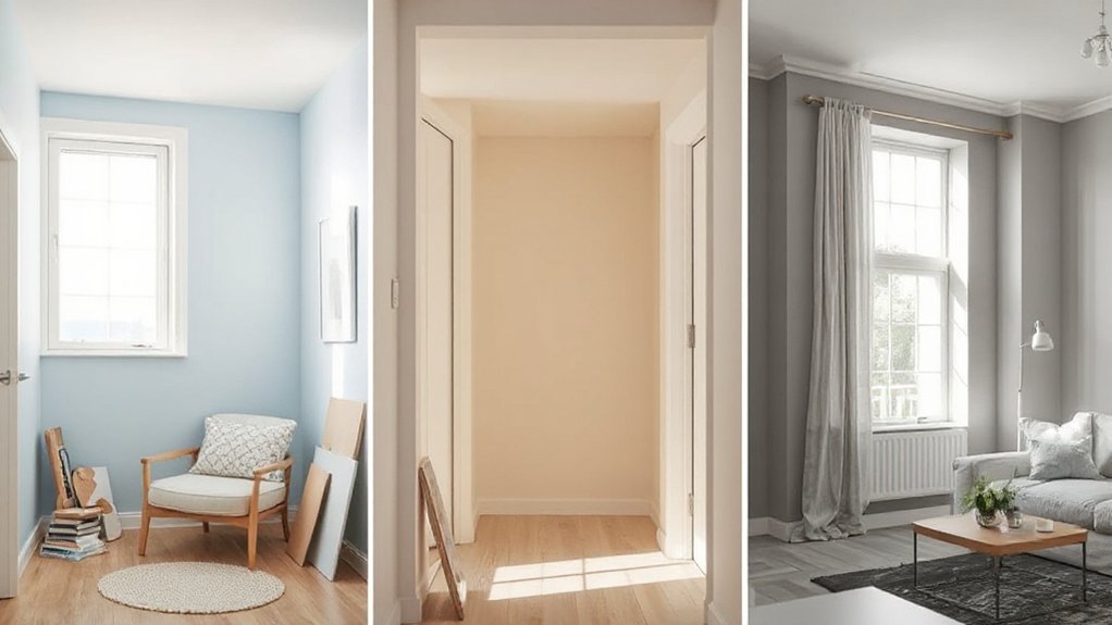
When you’re working with small rooms, low natural light, or expansive glazing, you need to select colors and finishes with the same precision you’d use for a lighting plan.
You’ll evaluate LRV (Light Reflectance Value), undertones, and finish sheen to control how color reads in compressed dimensions and shadowed corners.
You’ll also manage light and glare by coordinating wall color with window orientation, glass type, and artificial lighting to avoid hotspots, harsh reflections, and visual imbalance.
Colors For Small Spaces
Even in tight floor plans or tricky light conditions, you can manipulate paint color to visually expand a room, balance contrast, and control glare. Apply color psychology to choose hues that visually recede: cool, low-chroma tones (blue-gray, blue-green) push walls outward, while high-chroma colors pull them in.
- Ceilings – Use a cooler, lighter tint than the walls to raise perceived height. Keep sheen low to prevent visual heaviness.
- Walls – Specify mid-to-light LRV (50–70) to enlarge volume without washing out architectural detail.
- Trim – Paint trim slightly lighter than walls for subtle edge definition that doesn’t “box in” the room.
- Paint texture – Choose smooth, matte or eggshell finishes. Heavy textures create micro-shadows that visually shrink surfaces.
Managing Light And Glare
How do you harness paint to modulate light instead of fighting harsh glare or dull shadows? Start by mapping each wall’s exposure to natural light.
In small, low-light rooms, use light-neutral tones with eggshell or matte finishes; they diffuse incident light uniformly, preventing hot spots while maintaining luminance. Avoid high-gloss here—it amplifies specular reflection and highlights surface defects.
For south-facing rooms or big windows, prioritize glare reduction. Specify low- to mid-sheen finishes in neutral, desaturated colors; they control reflectance values, balancing brightness with visual comfort.
On window-opposite walls, choose slightly darker, warm neutrals to absorb excess light. For ceilings, a flat, high-LRV white disperses illumination evenly, minimizing contrast ratios that fatigue the eye and distort color perception.
How to Coordinate Paint Colors With Floors, Furniture, and Trim
Although wall color often feels like the star of the show, you get the most polished results by calibrating paint to the fixed elements in the room—flooring, large upholstery pieces, case goods, and trim profiles. Begin by mapping undertones with a color wheel so you can deliberately select complementary shades or low-contrast analogs instead of guessing.
- Floors – Read undertones in wood, tile, or carpet; pair cool floors with neutral grays, warm floors with greige or taupe to prevent visual discord.
- Large Upholstery – Treat sofas and sectionals as dominant color fields; echo or soften their hue on walls.
- Case Goods – Coordinate with wood stain temperature rather than exact match.
- Trim – Specify consistent white/cream throughout; adjust sheen, not color, for hierarchy.
Common Room‑By‑Room Paint Mistakes to Avoid
Once you start breaking color decisions down by space, you’ll see that most paint failures stem from predictable, room‑specific oversights rather than bad taste.
In bedrooms, you often ignore color psychology and overload the space with high‑chroma hues that elevate heart rate instead of promoting rest.
In kitchens and baths, you may prioritize color over moisture‑resistant sheens, leading to blistering and premature failure.
In living rooms, you might misjudge light reflectance value, choosing grays that read dull under warm LEDs.
Home offices frequently suffer from glossy walls that create monitor glare instead of low‑sheen, neutral backdrops.
Throughout the house, you may misuse paint texture—going too rough in dust‑prone halls or too slick on imperfect walls, which highlights every substrate flaw.
Frequently Asked Questions
Can I Mix Different Paint Brands or Lines in the Same Room?
You can, but you must test paint consistency and brand compatibility first. Check resin types, sheen levels, and VOC content; mismatched formulations can cause flashing, poor adhesion, or color variation, especially under raking light or in high-traffic zones.
How Does Paint Color Affect Home Resale Value Overall?
You boost resale value by leveraging neutral palettes; buyers read them as move‑in ready. You apply color psychology strategically: soft whites, greiges, and muted blues maximize resale impact, minimize perceived defects, and photograph ideally for online listings.
What’s the Best Season or Weather for Painting Interior Rooms?
You schedule interior painting for mild spring or fall days, not winter’s arctic dungeon or summer’s sweaty greenhouse. Prioritize 60–75°F temperature considerations, moderate humidity impacts (40–55%), and consistent ventilation to optimize curing, adhesion, and film formation.
How Often Should Interior Rooms Typically Be Repainted?
You should typically repaint interior rooms every 5–7 years, but high-traffic zones need 3–5. Evaluate film integrity, gloss retention, and chalking; reassess Color psychology impact and paint texture performance, especially in kitchens, baths, and sun-exposed spaces.
Are There Eco-Friendly Paints That Still Offer Strong Durability and Coverage?
Yes, you’ll find eco friendly formulations that perform like armored silk. Specify 100% acrylic, low-VOC or zero-VOC, high-solids content, and third-party certifications; these sustainable paint options maintain adhesion, scrub resistance, and opacity comparable to premium conventional coatings.
Conclusion
When you align paint type, sheen, and undertone with each room’s use, light, and finishes, you’re not just decorating—you’re engineering performance. You control washability in high-traffic zones, vapor resistance in wet rooms, and low‑chroma calm in bedrooms with the precision of a CAD drawing. Don’t wing it like a dial‑up remodel; apply these specs systematically so every surface works hard, looks intentional, and supports how you actually live in the space.