


You’ll get timeless colour combinations by matching lightness and undertones across your biggest surfaces, then repeating accents. Start with crisp white and warm wood for a calm base, or pair greige with clean white trim for modern elegance. Choose navy and white for tailored contrast, or cream and matte black for sharp definition. Keep bold colour to 5–10% and echo it twice. Test swatches in morning and evening light to refine your palette further.
Key Takeaways
- Separate lightness from undertone; keep one dominant lightness range and consistent undertones across walls, textiles, and finishes.
- Pair white with warm wood for a crisp, calming base; repeat the same wood tone in at least two elements for cohesion.
- Use greige with crisp white for modern elegance; test greige in changing light and anchor with matte black or warm oak accents.
- Combine navy with white for a coastal classic; repeat navy in three places and balance matte navy depth with bright white trim and linens.
- Choose cream with black for sharp definition; keep cream dominant, use matte black hardware, and repeat bold accents sparingly for timeless order.
How to Choose Timeless Colour Combinations (Light + Undertones)
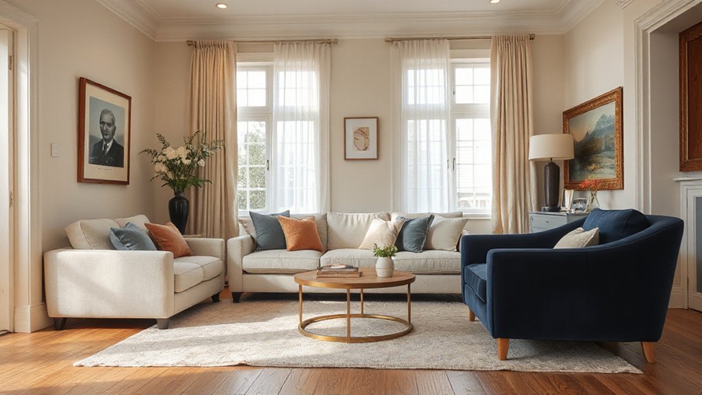
If you want colour combinations that still look refined years from now, start by separating two variables: lightness (how bright or deep a colour reads) and undertone (the subtle warm, cool, or neutral bias beneath it). Pick one dominant lightness range for walls and large textiles, then keep undertones consistent across the room. For example, pair light warm greige with mid warm taupe, or airy cool grey with deep charcoal—avoid mixing warm and cool neutrals unless you repeat each undertone at least twice. When Choosing complementary accent colors, match the accent’s undertone to your base, then shift lightness for contrast. When Incorporating bold color accents, limit them to 5–10% and repeat the hue in two small elements. Test swatches under day and evening light.
White + Warm Wood: The Timeless Neutral Base
Because white reflects light so efficiently, pairing it with warm wood gives you a neutral base that reads crisp but never sterile. Use it to control visual temperature: white keeps walls and ceilings clean, while oak, walnut, or maple adds warmth at eye level, supporting calm in Color psychology without dullness. Choose one dominant white (trim, walls, or cabinetry) and keep it consistent to avoid patchiness. Then repeat the same wood tone across at least two elements—floors and a console, or shelves and dining chairs—for reliable Furniture coordination. Balance grain with matte finishes, and add contrast through black hardware or linen textiles. In kitchens, match wood stools to open shelving for cohesion.
Greige + Crisp White for a Modern, Timeless Look
You’ll get a modern, timeless look when you balance greige’s warm and cool undertones to suit your room’s light. Use crisp white on trim, doors, and ceilings to sharpen edges and make the greige read clean, not muddy. Then layer texture—linen, wool, matte ceramics, and natural wood—so the greige feels rich and intentional rather than flat.
Balancing Warmth And Cool
While many palettes swing either too warm or too stark, greige paired with crisp white strikes a controlled balance that reads modern without feeling cold. You’ll master Balancing warmth and cool by choosing a greige with a clear undertone—taupe-leaning for north light, beige-leaning for south light—and keeping the white truly clean, not creamy. Test large swatches morning to night; greige can shift violet or green, and that shift decides whether the room feels refined or uneasy. For Creating harmonious colour palettes, repeat the ratio: let greige dominate broad surfaces, then use crisp white on adjacent planes and key furnishings to sharpen edges. Anchor the scheme with matte black hardware or warm oak so it stays timeless.
Crisp White Trim Accents
Once you’ve set a steady greige-and-white balance, crisp white trim accents lock the palette in and make the whole room read sharper and more intentional. Keep trim one clean white across baseboards, casings, and doors so greige walls feel calm, not muddy—classic colour psychology at work. Choose a durable semi-gloss for wipeability and light bounce, and extend white onto ceiling lines to lift height. Use decorative moulding sparingly: a simple picture rail or crown adds architecture without competing. Match undertones by testing next to your greige in morning and evening light, then commit room-wide for consistency.
- You’ll feel instant clarity at every doorway.
- You’ll notice brighter edges that energize.
- You’ll sense order and quiet confidence.
- You’ll admire tailored, gallery-like walls.
- You’ll relax knowing it’ll stay timeless.
Layering Textures With Greige
After you’ve anchored the room with greige walls and crisp white trim, texture does the heavy lifting that color doesn’t. You’ll get a modern, timeless look by layering textures that vary in sheen, weave, and weight, so the palette feels intentional instead of flat. Start with matte paint, then add a nubby wool rug, linen drapery, and a tailored bouclé chair. Bring in crisp contrast through white lacquer, ceramic lamps, or painted millwork. Use wood to warm the greige: rift-sawn oak, walnut, or ash, kept in clear or low-sheen finishes. For enhancing depth, mix metals with restraint—brushed nickel and aged brass work well together. Finally, repeat one texture twice to lock the scheme together.
Navy + White for Classic, Coastal Contrast

If you want a crisp coastal look that still feels tailored, pair navy with bright white to create strong, clean contrast without visual clutter. Use navy on larger anchors—sofas, cabinetry, or a feature wall—and keep white for trim, ceilings, and linens to sharpen edges. Choose matte navy for depth, then add a few glossy whites to bounce light. Keep undertones cool, and repeat navy in at least three places so the scheme feels intentional. Finish with Sea inspired decor and restrained Nautical accents to signal “coastal” without kitsch.
- You’ll feel instantly calmer in a room that looks ordered
- You’ll sense fresh air and open horizons
- You’ll get confidence from clean, tailored lines
- You’ll enjoy light that feels brighter, crisper
- You’ll feel grounded by navy’s steady depth
Cream + Black for Sharp, Classic Definition
Although cream reads softer than stark white, it still gives black the clean edge it needs for sharp, classic definition. Use cream on larger surfaces—walls, drapery, or a sofa—to keep the room bright, then apply black with intention for structure.
Choose matte black for hardware, window frames, and lighting to outline the space without glare. Ground the palette with a black rug border or lacquered side table, then repeat cream in layered textiles for depth. Keep undertones consistent: pair yellow-leaning creams with warm metals, or neutral creams with chrome. Add one high-quality pattern, like cream-and-black herringbone, to signal luxury decor without visual noise. This combination delivers interior elegance because it’s disciplined, graphic, and easy to maintain.
Charcoal + Soft Beige for Warm, Moody Neutrals
Two grounded neutrals—charcoal and soft beige—create a room that feels moody without turning cold. Use charcoal on built-ins, lower walls, or upholstery to anchor the space, then layer soft beige on ceilings, drapery, and rugs to keep light moving. Choose matte finishes for charcoal and warm undertones for beige so the pairing reads intentional, not flat. Balance contrast with Vintage furniture in wood, leather, or brushed brass, and sharpen edges with Artistic accessories that add personality without noise.
- You’ll feel held by depth, not darkness.
- You’ll get instant calm from softened glare.
- You’ll notice textures look richer and closer.
- You’ll sense quiet luxury in every corner.
- You’ll invite evening warmth, even at noon.
Sage Green + Ivory for a Calm, Heritage Palette

Because sage green carries a muted, botanical depth, pairing it with clean ivory gives your rooms a calm, heritage-leaning balance that still feels current. Use sage on cabinetry, wainscoting, or a feature wall, then keep ceilings, trim, and adjacent walls ivory to sharpen lines and brighten natural light. Choose a greyed, low-chroma sage to avoid reading mint, and sample it in morning and evening to confirm undertones. Ground the scheme with aged oak, antique brass, and linen textures to echo Heritage inspired colour palettes without looking staged. For durability, pick scrubbable eggshell on walls and satin on joinery, and prioritise Sustainable paint choices: low-VOC, water-based formulas. Finish with black accents for definition, not contrast. Add warm creams in textiles too.
Frequently Asked Questions
How Do I Test Paint Colours Accurately Under Different Artificial Lighting?
Test under each bulb you’ll use: daytime and night. Paint large paint samples on poster board, move them around, and view beside finishes. Compare against Natural light at windows, then under warm, cool, and dim settings.
Which Wall Paint Finishes Are Best for High-Traffic Rooms and Kids?
You’ll want scrubbable satin or eggshell for high-traffic and kids’ rooms. Test the theory: wipe a crayon mark—gloss resists, matte scuffs. Choose matte vs glossy wisely; add textured finishes to hide dents.
How Can I Coordinate Timeless Wall Colours With Existing Flooring and Rugs?
Match wall undertones to your flooring: choose warm greige for honey oak, cool off-white for grey tile, or soft taupe for beige carpet. Add Complementary accent hues via trim. Use Texture and pattern pairing with rugs.
What Are the Best Trim and Ceiling Paint Sheen Levels for a Cohesive Look?
Choose satin or semi-gloss for trim so you get durable trim contrast, and use flat or matte on ceilings to reduce glare while boosting ceiling brightness. You’ll keep walls in eggshell for easy cleaning.
How Often Should Timeless Colour Palettes Be Refreshed to Maintain a Modern Feel?
Refresh every 5–7 years, or sooner if daylighting, furnishings, or wear shifts the room’s balance. Use colour psychology to retune undertones, and track historical trends so updates feel current, not trendy.
Conclusion
When you’re choosing timeless colour combinations, you’re really deciding how your home will quietly speak for you. Start with light levels and undertones, then let proven pairings do the heavy lifting: white with warm wood for grounded ease, greige with crisp white for clean longevity, navy with white for tailored contrast, cream with black for sharp edges, charcoal with soft beige for cozy depth, and sage with ivory for calm character. You can’t go far wrong.