
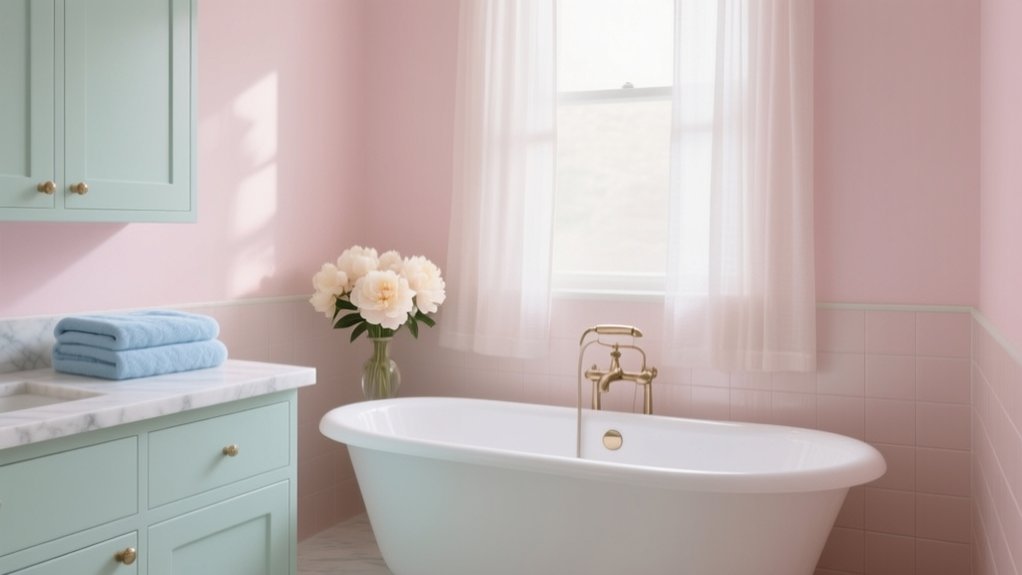

You’ll get a spa-calm, relaxing bathroom by choosing soft, chalky pastels that hold steady under UK daylight and warm LEDs—think muted blush, misty sage, or powdery blue. Test swatches by the mirror morning and evening, then pair your pastel with a warm white (beige-leaning) on ceilings, trim, and cabinetry for crisp balance. Layer high-CRI 2700–3000K lighting to cut shadows, and add oak, honed stone, and brushed metal for texture. Next, you’ll see how to layer walls, tiles, and a statement vanity.
Key Takeaways
- Choose muted blush, misty sage, or powdery blue; test swatches by mirrors and tiles in morning and evening bathroom lighting.
- Pair pastels with warm white trims, ceilings, and cabinetry to keep the scheme crisp and spa-like under grey daylight.
- Use chalky matte walls and eggshell/satin in splash zones to reduce glare, soften texture, and handle steam.
- Layer colour gently: whisper pastel walls, slightly deeper pastel tiles, and the strongest pastel on the vanity to anchor the room.
- Add warmth and depth with oak or ash, honed stone, and one consistent matte metal like brushed nickel or aged brass.
Choose Soft Pastel Colors for Your Bathroom Lighting

Because bathroom lighting shifts colour more dramatically than in any other room, you’ll want to choose soft pastels that stay calm under both daylight and warm LEDs. Test swatches beside mirrors and tiles, then view them morning and evening. For UK homes, muted blush, misty sage, and powdery blue hold their tone without turning grey or garish. Prioritise pastel paint options with a soft, chalky finish to reduce glare and hide minor wall texture. Your lighting fixture choices should support accurate colour: use high-CRI LEDs, aim for 2700–3000K, and layer ceiling light with vertical mirror lights to minimise shadows. If you’ve got a window, keep a cooler pendant away from it so daylight doesn’t clash.
Balance Pastel Bathrooms With Warm White Neutrals
While soft pastels set the mood, warm white neutrals keep a UK bathroom feeling crisp rather than sugary. Choose a warm white with a gentle yellow or beige undertone to counter grey daylight and cool LEDs common in British homes. Use colour psychology: warm whites signal cleanliness and calm, so your mint, blush, or powder blue reads spa-like, not nursery. Keep trims, ceilings, and most cabinetry in the same warm white to create a disciplined backdrop, especially in compact terraces and new-build ensuites. Rely on paint application techniques that reduce patchiness: mist-coat fresh plaster, cut in cleanly, then roll with a microfibre sleeve in a consistent W pattern. Finish in durable eggshell or satin for steamy rooms, and you’ll maintain softness without losing definition.
Layer Pastel Bathroom Walls, Tile, and Vanity Color
Once you’ve nailed your warm-white baseline, layer pastel across walls, tile, and the vanity in deliberate strengths so the room reads considered, not washed out. Start with a whisper on the walls: a misty blush, powder blue, or sage, keeping the ceiling crisp for lift in typical UK light. Then introduce tile in a half-step deeper tone—think pale aqua metro or soft lilac zellige—so wet zones feel defined without shouting. Give the vanity the strongest colour hit: a muted mint or dusky rose cabinet grounds the scheme and frames brassware and mirrors cleanly. Use Pastel wall accents sparingly on niches or a single return wall, and finish with Vibrant pastel accessories—soap dispensers, towels, or a bath mat—to sharpen contrast and keep it fresh.
Add Wood, Stone, and Matte Metals for Texture

If your pastel scheme risks feeling a bit flat in soft UK daylight, bring it into focus with tactile materials: wood, stone, and matte metals. Choose oak or ash wood accents on a vanity plinth, open shelf, or framed mirror to warm cool blush, mint, or powder blue. Introduce stone textures through honed limestone tiles, a terrazzo floor, or a compact quartz ledge; keep finishes matt to avoid glare in smaller British bathrooms. Then switch chrome for brushed nickel, aged brass, or blackened steel so fittings read calm and considered, not shiny. Repeat one metal across taps, shower trim, and lighting for cohesion. Balance weighty stone with slimmer timber details to keep the room light, practical, and spa-quiet.
Style Pastel Bathroom Accents That Feel Calm, Not Cute
Texture from timber, stone, and matte metals sets a grown-up base; the accents you add next decide whether your pastel bathroom reads serene or slips into nursery territory. Keep shapes crisp and functional: ribbed glass dispensers, a slim terrazzo tray, and a single tinted mirror rather than novelty prints.
Use Pastel color psychology to guide choices: powder blue lowers visual noise, sage calms, and blush warms when it’s muted and paired with off-white. Limit yourself to one pastel plus a neutral, then repeat it in two or three places only. Choose Pastel bathroom décor accessories in matte ceramics, brushed nickel, or blackened brass to ground the sweetness. Finish with thick white towels and one plant; skip frills.
Frequently Asked Questions
What Paint Finish Works Best for Pastel Bathroom Walls in High Humidity?
Choose a durable bathroom matt or soft-sheen acrylic with mould inhibitors; it resists steam yet hides flaws. You’ll keep Pastel wall textures refined, and Pastel color accents crisp. Pick washable, low-VOC, UK-grade formulations for longevity.
How Do I Prevent Pastel Tiles From Staining or Discoloring Over Time?
Stop pastel tiles staining by prioritising tile sealing: seal grout and porous tiles, then reseal routinely—coincidentally, just as limescale builds. Use pH-neutral cleaners, wipe spills fast, avoid bleach, add mats; you’ll lock in colour.
Are Soft Pastel Bathrooms Compatible With Accessibility and Aging-In-Place Design?
Yes, you can pair soft pastels with aging-in-place features. You’ll specify slip-resistant flooring, high-contrast edges, grab rails, and level-access showers. Use colour psychology and design trends to maintain calm while boosting legibility.
What Are Budget-Friendly Ways to Add Pastel Color Without Remodeling?
You don’t need a remodel—how inconvenient: paint one Accent wall in pastel, then layer Color accessories like towels, bath mats, and soap dispensers. Swap a shower curtain, add framed prints, and use peel-and-stick vinyl tiles.
Do Pastel Bathrooms Affect Home Resale Value Compared to Neutral Bathrooms?
Pastel bathrooms usually won’t hurt UK resale if you coordinate well, but neutrals attract broader buyers. Use pastel color psychology subtly and master pastel color coordination with timeless fittings, so viewers see polish, not a niche statement.
Conclusion
Choose soft pastels with your lighting in mind, then ground them with warm whites so the room still feels grown-up. Layer colour across paint, tile, and the vanity for depth, and bring in oak, stone, and matte brass to stop the palette looking sweet. Finish with calm, minimal accents. You’ll feel the payoff: the ONS reports UK adults spend around 11 minutes a day on personal care—make those minutes quieter, better designed, and more restorative.