


You’ll elevate a minimalist room by choosing one hero hue—cobalt, terracotta, or acid green—and repeating it in 2–3 big, clean moves against off-white walls, oat upholstery, and warm wood. Add 2–3 saturated accents (vases, books, ceramics) where your eye lands, repeating one shade twice. Anchor the palette with a statement rug, then echo it in a single bold cushion or throw. Finish with oversized art, a sculptural statement chair, or a painted niche—keep going for the best placements and pairings.
Key Takeaways
- Choose one hero colour and repeat it in 2–3 large moves, keeping the base calm with off-white, oat textiles, and warm wood.
- Add 2–3 small saturated accents (vases, books, ceramics) in eye-landing zones like consoles or coffee tables, repeating one hue twice.
- Use a statement rug to anchor the palette, then layer cushions and throws in the same tonal family with crisp textures like linen, boucle, or flatweave.
- Make one oversized artwork the main colour move, then pull its dominant hue into a few accessories using minimal frames and clean breathing space.
- Introduce a statement chair or a single bold accent wall against neutrals, echoing that colour once in a smaller piece for cohesion.
Pick One Hero Colour Accent (Simple Rule)
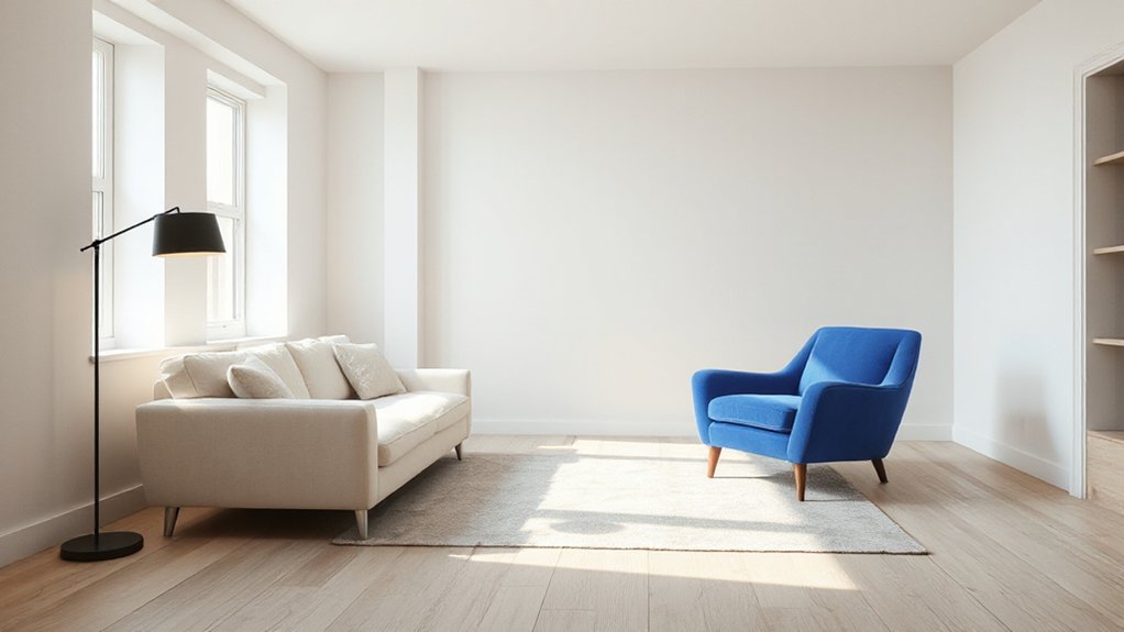
One hero colour is all you need to make a minimalist room feel intentional, not flat. Choose a shade you’ll commit to—cobalt, terracotta, acid green—and repeat it in two to three large moves, not scattered bits. Anchor it with one statement piece, then echo it once more so the room reads curated.
Keep your base calm through monochrome layering: off-white walls, oat upholstery, warm wood, and varied textures so the accent looks sharper. Use colour blocking to control impact—place the hero hue against a solid neutral plane, and keep surrounding tones either lighter or deeper, not competing. Limit secondary colours to undertones already present in your neutrals, and you’ll get boldness without clutter.
Small Colour Accents: Vases, Books, Ceramics
Two or three small, saturated accents—think a glazed ceramic vase, a tight stack of colour-spined books, or a single sculptural bowl—can sharpen a minimalist room without changing any major pieces. Place them where your eye already lands: console, coffee table, open shelf, or mantel. Keep the palette edited: repeat one hue twice, then echo it in a quieter tint for Monochrome layering. Choose forms with crisp geometry or intentional asymmetry so they read as design, not clutter. Mix matte ceramics with Metallic finishes—brass, chrome, or blackened steel—to add light play and depth against neutral walls. Vary height: one tall vessel, one medium stack, one low bowl. Leave negative space around each accent so colour feels curated, not noisy.
Colour Accent Textiles: Rug, Cushions, Throw
Anchor your minimalist space with a statement rug—it sets the colour story fast while the rest of the room stays quiet and clean-lined. Then layer in cushions and a throw in the same bold hue (or a tight, tonal range) to make the accent read intentional, not accidental. Keep textures crisp—flatweave, boucle, or linen—and let saturation do the heavy lifting.
Statement Rugs, Quiet Rooms
If your walls and major furniture stay calm, a statement rug can do the heavy lifting without breaking the minimalist spell. Choose one bold hue or graphic motif and let it anchor the room’s geometry, especially in open-plan spaces where zones blur. Keep the palette tight: pull a single rug colour into one small accessory elsewhere, then stop.
Prioritise scale and texture. Oversize rugs look intentional and reduce visual noise, while high–low piles or flatweaves add tactile interest without clutter. Use textile layering thoughtfully: place a neutral jute base under a vivid patterned topper for depth and easy seasonal swaps. Aim for crisp edges and consistent margins around furniture legs. Finish with accent lighting that grazes the rug’s surface, amplifying colour and weave.
Cushions And Throws Pop
Once the rug sets the room’s rhythm, cushions and throws let you echo that bold note at eye and hand level without adding hard visual mass. You control impact with fabric scale: a single saturated cushion reads graphic, while multiple tones feel curated, not chaotic. Build Layered textures—linen, bouclé, velvet, and chunky knits—to keep minimal furniture from looking flat.
- Anchor with one hero colour: choose two cushions in the same hue, different weaves, so it looks intentional.
- Add a disciplined secondary: pull a quieter shade from the rug to bridge sofa and floor.
- Rotate Seasonal color schemes: swap a throw for rust in autumn, cobalt in winter, or citron in summer, while keeping pillow inserts constant.
One Oversized Artwork as a Colour Accent
You’ll get the cleanest impact by treating one oversized artwork as the room’s main colour move—center it over the sofa or console, hang it at eye level, and give it breathing space. Match its palette with intent by pulling one dominant hue and one quiet secondary tone into your existing neutrals, then repeat them sparingly in accessories for a cohesive, current look. Keep the frame and mat minimal so the colour reads bold, not busy.
Statement Art Placement
While minimalist rooms lean on restraint, a single oversized artwork can deliver the bold colour hit that makes the space feel curated rather than bare. Treat placement like architecture: you’re guiding sightlines, anchoring furniture, and controlling negative space. Choose a piece with confident blocks of pigment—think vintage posters or crisp geometric patterns—then install it with intention, not decoration.
- Center it on the primary wall you face on entry, so the colour reads immediately and sets the room’s hierarchy.
- Hang it low enough to connect with key furniture (sofa, credenza, bed), keeping the bottom edge visually “resting” on the vignette.
- Give it breathing room: clear nearby shelves, avoid competing frames, and use focused lighting to sharpen contrast and depth.
Palette Matching Techniques
Even if the oversized artwork supplies the room’s boldest colour, you still need to match its palette with intent so the accent looks integrated, not accidental. Pull two secondary hues from the piece and repeat them in small, disciplined doses: a cushion piping, a ceramic vessel, a single book spine. Keep ratios tight—think 70/20/10—so the art stays dominant.
For monochrome harmony, echo the artwork’s main colour in varied values: charcoal to dove, cobalt to sky, rust to sand. This keeps minimalism calm while still graphic. If you want colour blocking, pair the artwork’s punchy tone with one clean counter-colour and let everything else read neutral. Match undertones (warm with warm, cool with cool), and align finishes—matte with matte, gloss with gloss.
A Statement Chair as the Colour Accent
Because minimalist rooms rely on restraint, a single statement chair can deliver the colour punch without cluttering the visual field. Set it against a neutral backdrop so the hue reads intentional, not noisy, and let it anchor your bold colour palette with confidence. Choose sculptural lines and tailored upholstery—bouclé, velvet, or leather—to keep the accent feeling current and refined. Then control the supporting cast.
- Pick one saturated hue (cobalt, oxblood, citron) and repeat it once in a small accessory to create cohesion.
- Use clean, contrast-rich materials—blackened steel, light oak, or chrome—to sharpen the chair’s silhouette.
- Place it where it works hardest: beside a sofa, at a desk, or in a reading corner for instant focus.
Bold Accent Wall or Painted Niche (High Impact)

If you want maximum colour impact without adding a single extra object, paint one wall—or better yet, a recessed niche—in a saturated, high-contrast shade. A bold accent wall anchors a minimalist layout, directing the eye and sharpening clean lines. Choose hues with depth—oxblood, inky teal, ultramarine, or clay red—and use a matte or eggshell finish to avoid glare.
A painted niche feels even more tailored: it frames shelving, art, or a single sculptural vase like a built-in gallery. Keep surrounding walls warm white or pale greige so the colour reads intentional, not busy. Extend the paint into the recess edges for a crisp shadow line, or wrap it slightly onto adjacent planes for a modern, architectural effect. Use premium paint for better coverage.
Frequently Asked Questions
What Paint Finish Best Highlights Bold Accents in Minimalist Rooms?
Choose matte or eggshell walls to spotlight bold accents; they reduce glare and sharpen color contrast. Pair with satin or semi-gloss trim for controlled pop, balancing paint sheen. You’ll keep minimalism crisp, current, and refined.
How Do Bold Colour Accents Affect Resale Value of a Minimalist Home?
Bold colour accents can raise resale value if you keep them strategic and reversible; you’ll attract buyers seeking personality without clutter. Use Color psychology to broaden appeal and maintain Interior harmony, avoiding polarizing hues.
Which Accent Colours Look Best Under Warm Versus Cool LED Lighting?
Under warm LEDs, you’ll get the best results from terracotta, mustard, olive, and blush; under cool LEDs, you’ll elevate cobalt, emerald, crisp teal, and magenta. Use Complementary color schemes and Mood enhancing hues for balanced, on-trend contrast.
How Can Renters Add Bold Colour Accents Without Damaging Walls?
You can add bold color without damage by using Temporary wallpaper panels, removable hooks, and washi tape frames. Swap in Fabric accents like vivid curtains, pillows, and slipcovers, plus statement rugs and art leaned on shelves.
What Are the Best Ways to Prevent Bold Accents From Fading in Sunlight?
You’ll stop bold accents fading by adding UV-blocking window film, rotating textiles, and choosing solution-dyed fabrics for fading prevention and sunlight protection. Like my rug that dulled in weeks, you’ll use lined curtains and UV sprays.
Conclusion
Keep your minimalist room sharp by choosing one hero colour and repeating it with intent. Layer small accents—vases, books, ceramics—then reinforce it through textiles like a rug, cushions, or a throw. If you want drama, commit to one oversized artwork or a statement chair that anchors the palette. For maximum impact, paint a bold niche or accent wall. Done right, colour acts like punctuation—clean, confident, unforgettable.