


You’ll get a more stylish home office when you choose paint by your light and desk finish, not a tiny store swatch. Test undertones from morning to night; bright rooms can make whites glare and greys turn blue, so use warm off-whites or greige, while low light suits mid-tones like soft sage or taupe. Pair oak with muted greens or dusty blues, and anchor focus with denim navy or forest green behind your monitor. Next, you’ll see bolder trim and accent tricks.
Key Takeaways
- Test paint undertones morning-to-night; strong daylight makes whites glare and greys blue, while low light darkens deep shades.
- Choose focus-friendly mid-tone greens or muted blues; place them behind the monitor and repeat in small accents for cohesion.
- Use modern neutrals like warm white or soft greige, then layer taupe and putty textures for depth without visual distraction.
- Anchor the desk wall with bold navy, forest green, or terracotta, keeping surrounding walls neutral for a stylish, intentional contrast.
- Coordinate wall colours with desk finishes and consistent hardware; add subtle colour inside alcoves, shelf backs, or door frames for depth.
Home Office Colours for Your Lighting

How does your home office light change the way paint looks? It shifts undertones, so you need to test colour where you work, morning to night. In strong natural light, crisp whites can glare and cool greys can read blue; soften them with warm off-whites, greige, or muted clay. In low natural light, deep shades swallow brightness; choose light-reflective mid-tones like warm taupe, soft sage, or dusty peach to keep walls lively without feeling stark.
Under artificial lighting, bulbs decide everything. Warm LEDs amplify yellow and make creams richer; balance with cleaner beiges or gentle blue-greens. Cool LEDs flatten warmth; choose warmer neutrals or rosy whites. Paint large swatches and view them beside your monitor.
Colours That Work With Your Desk and Decor
Once you’ve seen how light shifts your paint, match your wall colour to the finishes you live with every day—your desk, shelving, and key decor pieces. If you’ve got a warm oak or walnut desk, steer toward muted greens or dusty blues that calm the grain and keep the space sharp. With black metal frames or a lacquer desk, you can push richer hues—ink navy, forest green, or oxblood—for contrast that still reads professional. Use Complementary colour schemes to make accents pop: pair blue walls with small hits of terracotta, or green walls with brass and warm leather. For fast colour coordination tips, repeat one finish three times (desk, lamp, frames) and keep hardware consistent.
Modern Neutral Home Office Colour Palettes
Where do modern neutrals really earn their keep in a home office? When you need a polished backdrop that won’t compete with screens, paperwork, or changing projects. Start with warm white or soft greige on walls, then layer mushroom, taupe, and putty through textiles and storage for depth without visual noise. Add contrast with matte black hardware or smoked oak to keep it contemporary, not bland.
Use Color psychology: creamy bases feel welcoming, while cooler stone reads crisp and task-ready. Keep design harmony by repeating one undertone (warm, cool, or rosy) across paint, flooring, and fabrics. Finish with a single accent in metal or leather for structure, and choose one sheen level—eggshell walls, satin trim—for a clean, modern line.
Green and Blue Home Office Colours for Focus
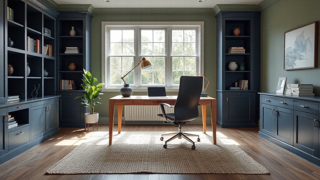
Although bold colour can feel risky in a workspace, green and blue earn their place because they steady your mood and sharpen focus without stealing attention from your screen. Use colour psychology to pick a direction: mid-tone sage or eucalyptus reads calm and balanced, while deeper forest adds authority without going gloomy. Apply shade psychology with undertones—cool greens feel crisp; olive leans sophisticated. For blues, choose muted denim or dusty navy to reduce visual noise and keep video calls flattering. Paint the wall behind your monitor, not the one in your eyeline, so you get depth without distraction. Then echo the hue in one or two accents—desk lamp, pinboard, or rug—to keep the palette intentional and modern.
Warm Home Office Colours for Cozy Concentration
Shift your home office toward warmth and you’ll get cozy concentration without sacrificing clarity. Start with earthy neutrals—sand, oat, taupe—to keep your backdrop calm, then layer in terracotta and clay accents for on-trend energy. Finish with warm woods and brushed metals to add depth, balance light, and make the space feel intentionally designed.
Earthy Neutrals For Focus
Earthy neutrals—think warm taupe, soft clay, mushroom, and sandy beige—create a calm, grounded backdrop that helps you stay focused without making your home office feel stark. Use them on walls or built-ins to reduce visual noise and keep screens comfortable on your eyes.
Layer depth with matte finishes, woven textiles, and natural wood so the space feels intentional, not bland. Bring in natural stone textures through a desk accessory, lamp base, or shelving detail for a modern, architect-led look. Keep contrast controlled: pair beige with charcoal hardware or black frames to sharpen lines without breaking the mood. Finally, echo organic plant palettes—olive, eucalyptus, and deep green—in art and foliage to add life while staying work-appropriate and steady.
Terracotta And Clay Accents
Once you’ve set a calm base with warm neutrals, terracotta and clay accents add the cosy heat that keeps a home office feeling human without distracting you. Use them as controlled pops: a painted pinboard frame, a muted feature stripe behind your monitor, or a desk mat in burnt sienna to anchor your setup.
Lean into Terracotta textures through plaster-look planters, matte ceramics, or a ribbed lampshade that softens glare. Add Clay pottery accents on open shelving—one sculptural vase, a small lidded jar for cables, or a pencil cup—so the colour reads curated, not chaotic. Keep finishes matte, stay within two related shades, and repeat the tone twice in the room to make it feel intentional.
Warm Woods And Metals
How do you make warm home office colours feel grounded rather than heavy? You layer warm woods with light-reflective metals, then balance them with crisp neutrals. Start with oak, walnut, or ash in your desk or shelving; keep grains visible for instant warmth without visual clutter. Add brushed brass, aged bronze, or matte black hardware to sharpen the palette and boost focus. If you’re using rustic furniture, streamline it with slim profiles and clean-lined task seating. Control the glow: choose a warm-white bulb, then mirror it with a brass desk lamp. Finish with vintage accessories—an old clock, metal trays, or framed prints—to add patina without chaos. Keep walls soft cream or pale greige so wood tones lead.
Bold Accent Colours for Walls, Trim, and Decor
You can sharpen your home office fast with a statement accent wall—think deep green, inky navy, or terracotta behind your desk to anchor the room. Push it further with colourful trim and molding in high-contrast shades to frame windows, doors, and built-ins with a designer edge. Finish with bold decor colour pops—art, task lamps, and textiles—so the space feels energized without overwhelming your focus.
Statement Accent Wall Ideas
While a full-room colour drench can feel like a commitment, a statement accent wall delivers maximum impact with minimal paint. Pick the wall you face most often—behind your desk or on camera—so colour works harder. Go saturated: inky navy, deep olive, oxblood, or charcoal to sharpen focus and add instant polish. For modern statement wall ideas, use oversized colour blocking, a crisp half-height band, or a painted arch that frames shelving. Try accent wall paint techniques like limewash for soft movement, a matte base with high-gloss stripes for depth, or a tonal ombré that won’t overpower the room. Keep the rest neutral, then echo the accent with a desk lamp, art, or a pinboard to look intentional.
Colourful Trim And Molding
Because most home offices lean neutral by default, colourful trim and molding gives the room a designer edge without overwhelming your workspace. Paint baseboards, door casings, and window frames in a confident shade—ink navy, forest green, or warm terracotta—then keep walls calmer for balance. For a modern look, choose contrasting trim that’s one to two shades deeper than the wall; for a tailored, heritage feel, flip it and run lighter trim against saturated paint. Highlight decorative moldings by matching sheen to function: eggshell on walls, satin on trim for crisp wipeability. Keep lines sharp with quality tape, and prep properly—fill gaps, sand, and prime—so colour reads intentional, not patchy.
Bold Decor Colour Pops
Even if your home office stays mostly neutral, bold colour pops add instant energy and a curated, trend-led finish. Pick one hero shade—cobalt, paprika, acid green—and repeat it three times for cohesion: a painted shelf back, a chair, and a small rug.
Use colour with intent on walls and trim. Paint a single alcove or the inside edge of door frames to create depth without visual noise. Anchor the palette with Vibrant wall art, then balance it with matte black or brushed brass hardware for contrast.
Don’t forget the ceiling line: a slim band of colour above the crown draws the eye up. Finish with statement lighting in a tinted glass or lacquered shade to amplify the accent.
Frequently Asked Questions
How Do I Choose Paint That’s Low-Voc and Office-Safe?
Choose paint labeled low-VOC or VOC free coatings, verified by GREENGUARD Gold or similar. Check safety data sheets, avoid added formaldehyde, and pick Eco friendly pigments. Ventilate well, cure fully, and prefer washable matte finishes.
What’s the Best Finish for Office Walls: Matte, Eggshell, or Satin?
You won’t regret skipping matte: choose eggshell for most office walls—it balances paint durability with a soft, modern look. If you fear scuffs, go satin for high-traffic spots. Use color psychology to keep focus.
How Many Gallons of Paint Do I Need for My Home Office?
You’ll need about 1 gallon per 350–400 sq ft per coat; measure wall area, subtract doors/windows, then double for two coats. Color psychology guides sheen; paint application techniques (rollers, edging) reduce waste.
Should I Paint the Ceiling in a Home Office, and What Colour?
Yes—you should paint it; it’ll polish the room. Pick ceiling color options like crisp white for brightness, pale blue for calm, or soft gray for focus. Try creative ceiling ideas: subtle stripes or matte.
How Can I Test Colours Accurately Before Committing to Painting?
Buy sample pots and paint large swatches on foam boards; move them around daily. Check under morning/night bulbs for lighting effects, and note Color psychology. Test alongside trim and flooring, then commit.
Conclusion
You’ve got everything you need to dial in a home office colour scheme that looks current and works hard. Read your lighting first, then let your desk and decor steer the undertones. Layer modern neutrals for calm, or lean into greens and blues when you need clean focus. Warm terracottas and soft ochres keep long sessions cozy. Finish with a bold accent—crisp trim, a painted niche, or art that pops—so the room feels sharp.