
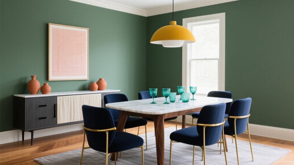

You can modernise your dining room by pairing greige with crisp white trim for a bright, clean base, or navy with warm wood to keep moodiness inviting. Try sage with creamy beige for organic calm, or charcoal with blush for softened contrast. For timeless impact, use matte black with antique brass. Add sunbaked warmth with terracotta and soft pink, or go bold with teal and mustard in controlled accents. Continue for placement, finishes, and lighting specifics.
Key Takeaways
- Pair greige walls with crisp white trim and warm 2700K lighting for a bright, modern dining room with clean contrast.
- Use navy walls with walnut or oak furniture and layered lighting to create a moody yet inviting, contemporary feel.
- Combine sage green with creamy beige and textured finishes like limewash or linen for calm, organic elegance.
- Balance charcoal elements with blush accents, then add walnut or pale oak to keep the look sophisticated and softened.
- Mix black with brass, then layer terracotta and soft pink in restrained accents for a modern, sunbaked palette with luxe edge.
Greige + Crisp White: Bright, Modern Base
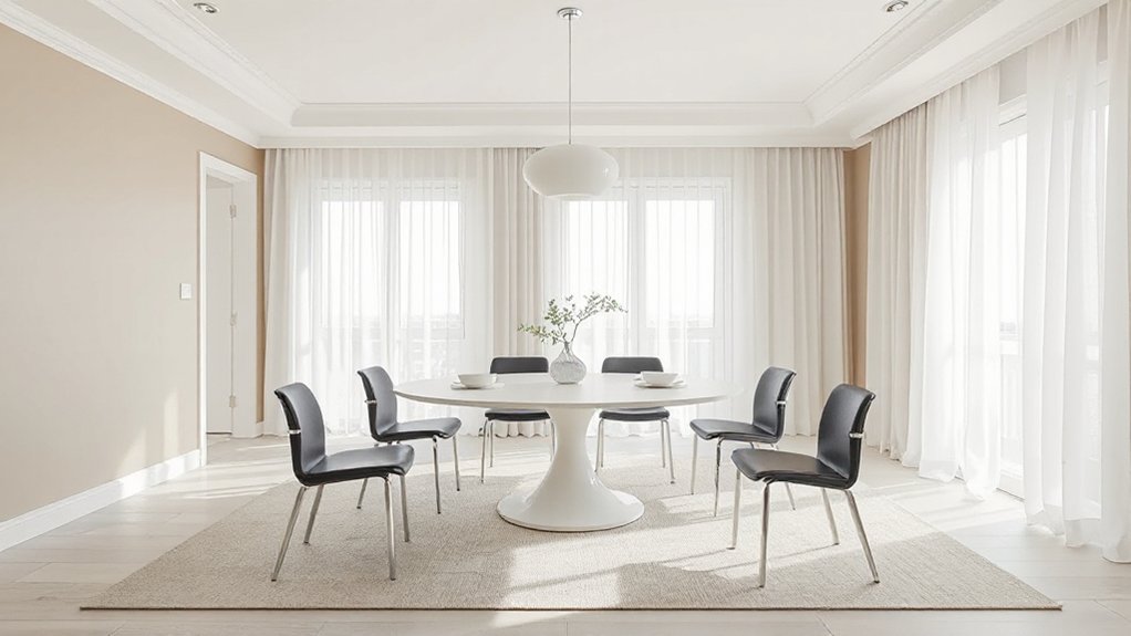
If you want a dining room that feels current without chasing fads, pair greige walls with crisp white trim and millwork for a bright, modern base. You’ll get balanced warmth and clarity: greige softens glare, while white sharpens edges and highlights architectural lines. Use Color psychology to guide sheen and undertone—choose a warm greige to encourage comfort, or a cooler greige for a more tailored mood. Keep ceilings and casings in a clean, true white to prevent muddiness. For furniture coordination, anchor the room with a table in light oak, walnut, or black-stained ash, then repeat white in chair frames or a sideboard for cohesion. Finish with clear glass, brushed nickel, and linear lighting to sustain the modern read.
Navy + Warm Wood: Moody Without Feeling Dark
You’ll get a refined, moody dining room by balancing navy’s saturation so it reads rich rather than heavy. You can then spotlight warm wood tones—walnut, oak, or teak—to bring tailored warmth and visual relief against the blue. You’ll finish the scheme with layered lighting that creates soft contrast, keeping corners luminous and the overall palette crisp.
Balancing Navy Saturation
How do you bring navy into a dining room without letting it read heavy? Start with Balancing navy saturation: choose a navy with a clean undertone (not overly inky) and specify the finish before you commit. Matte reads velvety and modern, yet it absorbs light; satin gives you crisp definition and a controlled sheen that lifts the colour.
Apply navy depth control through placement and proportion. Keep the darkest value below eye level on built-ins or a banquette, then transition to lighter neutrals above to preserve visual height. If you paint walls, limit coverage with paneling, a single focal wall, or a ceiling kept brighter. Finally, test large swatches under evening lighting, since dining rooms skew warmer and navy can deepen fast.
Highlighting Warm Wood Tones
Once you’ve controlled navy’s saturation and placement, warm wood becomes the element that keeps the palette moody without reading dark. You’ll get the best effect by introducing timber at mid-height: a dining table, sideboard, or wall panelling that visually “lifts” the scheme. Choose Warm oak finishes with a balanced stain—neither too honeyed nor too grey—so the navy feels tailored rather than heavy.
Prioritise Wood grain textures, because their natural variation breaks up large blocks of colour and adds quiet movement. If your navy reads inky, select rift-sawn oak or walnut with linear grain to sharpen the look; if your navy leans classic, opt for cathedral grain for softness. Keep metal accents restrained, and let the timber read as the room’s warmth.
Lighting For Soft Contrast
Because navy absorbs light rather than bouncing it, the right lighting plan becomes the soft-contrast tool that keeps warm wood rich and the room atmospheric, not gloomy. Layer your sources: start with dimmable ceiling fixtures for an even Ambient glow, then add targeted pendants over the table to define the navy-and-oak palette with clean edges.
Specify warm LEDs (2700–3000K) to echo timber undertones and prevent the blue from turning cold. Aim beams at wood grain, not walls, so you lift reflectance without flattening colour depth. Use wall sconces or a slim picture light to create deliberate shadow play across panelling, cabinetry, or art, which reads tailored rather than dramatic. Finally, set lighting on scenes: brighter for dining, lower for evening hosting.
Sage + Creamy Beige: Calm, Organic Dining Rooms
You’ll create a calm, organic dining room by layering sage through matte paint, linen upholstery, and subtly patterned textiles that keep the green nuanced rather than flat. You’ll balance that softness with creamy beige accents—plaster-toned walls, upholstered chairs, or a textured rug—that add warmth without yellowing. You’ll finish the look by mixing these tones across varied finishes, so the palette feels current, tactile, and intentionally restrained.
Layered Sage Textures
While bold palettes still have their place, layered sage textures paired with creamy beige set a calmer, more organic tone that feels unmistakably current. You’ll get the most refinement when you treat sage as a spectrum: misty greens on larger planes, deeper olive notes in tactile finishes, and soft grey-green in transitional pieces. Specify Textured wall treatments—limewash, microcement, or grasscloth—to introduce depth without visual noise. Then echo that dimension through layered fabric patterns: a subtly slubbed linen tablecloth, nubby upholstery, and a low-contrast geometric on seat pads. Keep sheen disciplined; favour matte and eggshell so light reads as softness, not glare. You’ll create a dining room that feels composed, restorative, and quietly elevated.
Creamy Beige Accents
In a sage-led dining room, creamy beige acts as the stabilising neutral that softens contrast and keeps the palette feeling architectural rather than rustic. You’ll get a calm, organic effect by placing beige on high-visibility planes: upholstered dining chairs, linen drapery, a textured rug, or a matte-painted sideboard. Keep undertones consistent—choose beige with a gentle yellow or pink cast to prevent sage from reading grey.
For Elegant monochromes, repeat beige in varying sheens: bouclé, brushed oak, and travertine ceramics. Then introduce subtle metallics with restraint—aged brass picture lights, champagne-toned flatware, or a warm pewter pendant—to sharpen edges without breaking serenity. You’ll maintain a tailored look by favouring clean-lined silhouettes and minimal pattern scale.
Charcoal + Blush: Soft Contrast That Feels Modern
Because charcoal carries a tailored, architectural weight, pairing it with blush creates a controlled softness that reads unmistakably modern in a dining room. You’ll notice the Color psychology at work: charcoal grounds the space with confidence, while blush signals welcome and calm, preventing the palette from feeling severe. Use charcoal on walls, a sideboard, or upholstered dining chairs, then introduce blush through linen drapery, a matte ceramic vase, or seat cushions for a refined glow. For furniture pairing, choose clean-lined walnut or pale oak to bridge the tones, and keep silhouettes crisp to maintain the contemporary edge. Balance contrast with layered neutrals—stone, off-white, and smoke—so the room feels curated, not themed. Finish with textured textiles to soften acoustics.
Black + Brass: High-Impact, Timeless Pairing
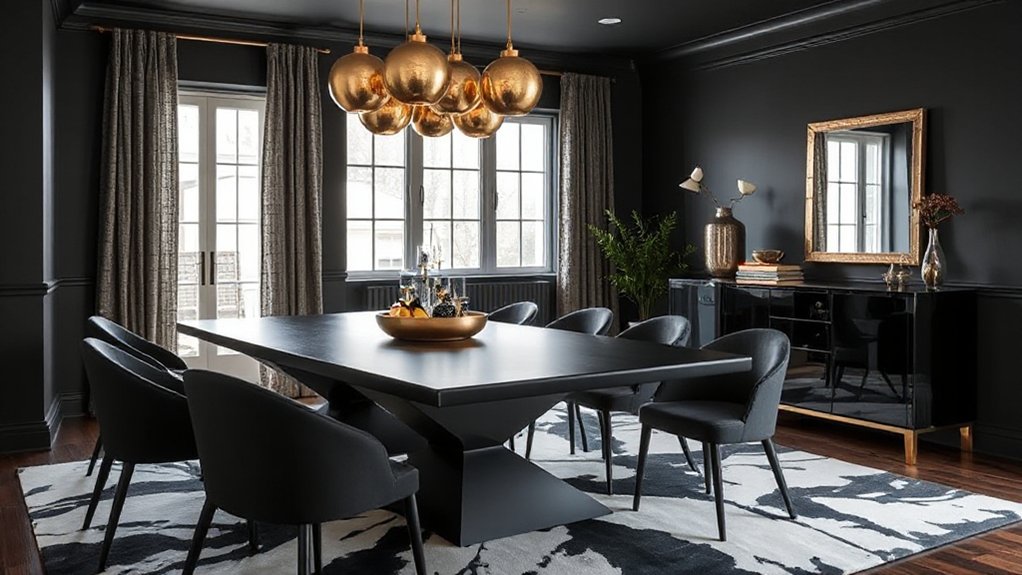
When you pair black with brass, you get instant visual hierarchy—black sharpens edges and adds depth, and brass injects warmth with a tailored, light-catching sheen. You’ll create a luxury statement that reads confident, not cold, especially when you balance matte black surfaces with brushed or antiqued metal for subtle vintage appeal.
- Choose black lacquer or ebonised wood for the table to anchor the room.
- Add brass via pendant lights or sconces, keeping finishes consistent.
- Introduce black-framed art and mirrors to repeat lines and maintain rhythm.
- Layer tactile neutrals—linen napkins, wool seat pads—to soften contrast.
Keep accents restrained; let crisp silhouettes and reflective highlights do the work. This pairing stays current across seasons.
Terracotta + Soft Pink: Warm, Sunbaked Charm
Although terracotta and soft pink sit close on the warm spectrum, they create a nuanced, sunbaked palette that feels both modern and softly romantic rather than overly sweet. You’ll get depth from Terracotta tones on walls, a plaster-effect finish, or upholstered dining chairs, while Soft pink accents refine the scheme through linen napkins, ceramic glazes, or a matte pendant.
Keep undertones consistent: choose clay-based terracotta and a muted blush with a hint of beige to avoid a candy effect. Balance warmth with crisp contrast by introducing off-white trim, pale oak, or travertine, and specify blackened hardware sparingly for definition. For lighting, you should favour warm LEDs (2700K) so both hues read rich, not ruddy. Add a single green plant to sharpen the palette.
Teal + Mustard: Bold Accents That Still Blend
Set teal against mustard and you get a high-contrast pairing that still reads cohesive, provided you treat one as the anchor and the other as the accent. Use Color psychology to guide balance: teal feels composed and tailored, while mustard brings optimistic warmth. You’ll keep the look refined by repeating each hue in measured doses and letting neutrals stabilise the scheme.
- Anchor teal on walls or upholstered dining chairs for depth and formality.
- Add mustard through art, a runner, or pendant shades to lift the palette.
- Prioritise furniture coordination: pair walnut, blackened steel, or travertine to bridge both tones.
- Control saturation with off-white, greige, or smoked glass so the contrast stays elegant.
Frequently Asked Questions
What Paint Finish Works Best for Dining Room Walls: Matte, Eggshell, or Satin?
You’ll get the best results with eggshell for most dining room walls; it balances paint durability and a refined, modern sheen. Choose matte for forgiving wall texture, and satin when you need extra wipeability in high-traffic homes.
How Do I Choose Lighting Temperature to Match My Dining Room Colour Palette?
Choose lighting temperature by matching undertones: use 2700–3000K for warm neutrals, 3000–3500K for balanced palettes, and 3500–4000K for cool schemes. You’ll maintain colour palette harmony and showcase contemporary finishes elegantly.
Which Colours Make a Small Dining Room Feel Larger and Brighter?
You’ll make a small dining room feel larger and brighter with crisp whites, pale greiges, soft sages, and cool light blues. Color psychology calms; Visual expansion techniques include tonal layering, glossy finishes, and high-LRV ceilings.
How Can I Coordinate Dining Room Colours With an Open-Plan Living Space?
Repeat key hues, refine undertones, align finishes across zones so you coordinate seamlessly. You’ll build Color harmony with one anchor neutral and two accents, and guarantee furniture coordination by matching wood tones, metals, and textiles.
What’s the Best Way to Test Paint Colours Under Evening and Daylight?
Paint large sample boards and move them across walls. Check in Natural light morning-to-afternoon, then under Artificial lighting at dinner time. Compare beside trim and fabrics, and photograph for consistent, trend-aware evaluation.
Conclusion
You’ve seen how greige and crisp white sharpen a modern base, while navy and warm wood add depth without dimming the room. Sage with creamy beige keeps the palette organic; charcoal with blush delivers refined contrast. Black and brass read timeless, terracotta with soft pink feels sunbaked, and teal with mustard brings confident energy. Choose the pairing that fits your light and finishes—like a well-tailored suit, it elevates everything you place within it.