
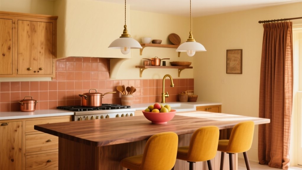

Warm up your kitchen fast by choosing warm white paint with yellow or taupe undertones for walls and cabinets, or a creamy beige that suits your natural light. Add buttery yellow in small doses on an island, toe-kick, or textiles. Try soft peach for a gentle glow, or terracotta on a backsplash for earthy depth. Balance cool quartz and steel with warm wood tones, then punch up character with spice colors. Finish with brushed brass, bronze, or copper—and there’s more to fine-tune.
Key Takeaways
- Paint cabinets and walls a warm white with yellow or taupe undertones to keep the kitchen bright and welcoming under LEDs.
- Use creamy beige or warm greige on walls for timeless warmth; test swatches morning and evening to confirm undertones.
- Add natural wood accents like oak shelves, walnut stools, or a butcher-block prep zone to introduce tactile, cozy warmth.
- Choose warm metals—brushed brass, bronze, or copper—for hardware and lighting to enhance warmth and add crisp definition.
- Layer muted buttery yellow or spice tones (saffron, paprika) through an island, toe-kicks, textiles, or accessories for inviting color.
Warm White Paint for Walls and Cabinets

If you want a kitchen that feels bright but still welcoming, start with a warm white on your walls and cabinets. Choose a white with a subtle yellow, taupe, or peach undertone so it doesn’t read sterile under LEDs. In an open Kitchen layout, this shade keeps sightlines clean while softening hard finishes like quartz, stainless, and tile. Use the same warm white on uppers and lowers for a seamless, current look, then add contrast through hardware and lighting rather than paint. For small rooms, paint trim and ceiling to match to reduce visual breaks and boost height. Pair the palette with smart Storage solutions—full-height pantry doors, integrated toe-kick drawers, and open shelves—to keep counters calm and the warmth uninterrupted.
Creamy Beige Kitchen Paint for Timeless Warmth
You’ll get timeless warmth with creamy beige when you choose a shade that matches your kitchen’s undertone—pink-peach for cozier rooms, yellow-gold for sunlit spaces, or greige-leaning beige for a more modern look. Pair it with warm accents like brass hardware, natural oak, terracotta, or creamy stone to keep the palette current and intentional. Test swatches in morning and evening light, because bulbs and daylight can shift beige from inviting to flat if the undertones don’t align.
Choosing The Right Shade
Where do you start when every beige on the swatch wall claims to be “warm”? You narrow it down by undertone and light. For creamy beige kitchen paint, you want a subtle yellow, peach, or pink base that reads inviting, not muddy. Color psychology matters: warmer beiges feel welcoming and steady, while cooler ones can turn flat under LEDs.
- Check undertones against a true white card in daylight
- Test on two walls: one sunny, one shadowed
- Watch for green or gray shift at dusk
- Match LRV to your room: higher for dim kitchens
- Choose paint finish options: eggshell for walls, satin for wipeability
Commit only after a 24-hour sample; beiges change fast.
Pairing With Warm Accents
Because creamy beige kitchen paint sits in the “quiet neutral” lane, warm accents do the heavy lifting—bringing depth, contrast, and that lived-in glow without fighting the walls. Start with hardware in aged brass or bronze; it reads current, not dated, and sharpens cabinet lines. Layer in oak or walnut stools, open shelving, or a butcher-block prep zone to add tactile warmth.
For Creative ways to incorporate warm accents, use terracotta canisters, rust-toned runners, or clay pendants, and echo them with cinnamon spice racks or copper cookware on rails. If you like contrasting cool color schemes, keep your backsplash slate, soft sage, or inky navy, then bridge the shift with warm veining in quartz and caramel leather pulls.
Lighting And Undertones
Although creamy beige kitchen paint reads as an easy neutral, your lighting—and the undertone beneath that “cream”—determines whether it feels buttery and inviting or dull and slightly gray. Test the shade across day and night, then tune bulbs and finishes to protect undertone harmony.
- North light: choose beige with a soft yellow or peach base
- South light: pick balanced cream to avoid looking too golden
- East/West light: expect shifts; sample on two walls
- Ambient lighting: use 2700K–3000K LEDs, high CRI for true color
- Metals: brushed brass warms; chrome can cool the beige down
If your cabinets read pink, add warmer bulbs; if they skew green-gray, steer toward creamier, red-based beiges and matte walls for stability.
Buttery Yellow Accents to Brighten a Kitchen
Add buttery yellow cabinet details—think inset panels, toe-kicks, or a painted island—to lift your kitchen’s warmth without overpowering it. You’ll reinforce that glow with sunny textiles and accessories like striped tea towels, a cushioned runner, and ceramic canisters that read cheerful, not cartoonish. Keep the yellow slightly muted and pair it with brass or light oak so it feels current and polished.
Buttery Yellow Cabinet Details
When you want your kitchen to feel instantly warmer without committing to a full-color overhaul, buttery yellow cabinet details deliver. You can keep your main cabinetry neutral and use subtle color blending to introduce warmth where the eye naturally lands—rails, stiles, interior frames, or a single accent run.
- Paint just upper cabinet insets for a modern, lifted look
- Highlight toe-kicks to add a soft “glow” at floor level
- Tint open-shelf back panels to deepen depth and contrast
- Use a satin finish to reflect light without looking glossy
- Pair with warm metals and creamy whites for balanced cohesion
You’ll get a sunny note that still reads refined, especially in kitchens with limited daylight. Keep undertones creamy, not neon, so everything stays timeless.
Sunny Textiles And Accessories
Buttery yellow doesn’t have to live on cabinetry to make an impact—textiles and small accessories can carry that same warmth with even less commitment. Start with tea towels, oven mitts, and café curtains in a soft, creamy yellow; they read sunny without feeling loud. Layer in Cozy woven textiles like a flatweave runner or seat cushions to add texture and quiet durability in high-traffic zones.
For pattern, choose Sunlit floral patterns that mix yellow with warm whites, clay, or sage, so they feel current and grounded. Swap in buttery-yellow canisters, a citrus bowl, or a gloss-glazed utensil crock to echo the tone on countertops. Keep metals consistent—brass or warm nickel—and you’ll get a cohesive, inviting glow. Rotate pieces seasonally.
Soft Peach Walls for a Gentle Blush Glow
Although peach reads playful in theory, soft peach walls deliver a refined blush glow that instantly makes your kitchen feel warmer and more welcoming. You’ll notice they flatter skin tones, soften hard edges, and bounce daylight without the starkness of white. Choose a muted, low-saturation Soft peach with a creamy undertone to keep it current, then pair it with brushed brass, pale oak, or matte black for crisp contrast. For a polished result, focus on these details:
- Eggshell finish to hide scuffs and clean easily
- Warm-white ceiling paint to prevent pink cast
- High-CRI bulbs (2700–3000K) to enhance blush glow
- White quartz or cream stone to stay airy
- Simple art in neutrals to avoid visual noise
Terracotta for Backsplashes and Statement Walls

If you want warmth that feels grounded rather than sweet, terracotta delivers it fast—especially on a backsplash or a single statement wall. Use glazed terracotta to bounce light and resist stains, or go matte for a sunbaked, modern finish. You’ll get the best results when you repeat the tone in small accents, then let it stay the hero.
Lean into Terracotta tile patterns that feel current: slim stacked rectangles, checkerboard mixes of clay and cream, or handmade zellige-style edges for depth. Keep grout warm-beige, not stark white, so the surface reads cohesive. If you’re considering terracotta kitchen islands, echo the island’s undertone in the backsplash to avoid a mismatched, muddy look. Seal porous surfaces, and choose heat-rated pieces behind ranges.
Warm Wood Tones That Balance Cool Surfaces
When cool surfaces like marble, stainless steel, or concrete start to feel a little stark, warm wood tones pull the whole kitchen back into balance without fighting the palette. You’ll get instant Rustic charm while keeping the look modern, especially when you choose mid-tone oak, walnut, or smoked ash with a matte grain. Use wood to soften edges and add tactile depth, not visual clutter. Prioritize Eco friendly finishes like plant-based hardwax oils or low-VOC sealers so the warmth looks natural and wears well.
- Add a walnut island panel to ground glossy counters
- Choose oak open shelving to break up steel runs
- Wrap a concrete hood in veneer for warmth
- Install butcher-block accents near prep zones
- Repeat wood in stools or trim for cohesion
Spice Colors for Bold Cabinets and Décor
Because neutrals can read flat under bright task lighting, spice-inspired hues—think paprika, saffron, cinnamon, and clove—give your kitchen an instant, lived-in warmth that still feels current. Put paprika or cinnamon on lower cabinets for a grounded look, then keep uppers light to prevent visual heaviness. If you’re testing the waters, start with Bold kitchen accents: a clove-painted island, saffron bar stools, or a paprika runner that hides everyday splashes.
Treat Spice color palettes like you would food: balance heat with cream, oat, and warm greige, and repeat tones twice for cohesion. Choose matte or eggshell paints to soften glare, and use deeper spices on trim to sharpen edges without turning harsh. Keep saturated shades away from tiny windowless walls.
Warm Metal Finishes to Tie the Palette Together

Although paint sets the temperature of your kitchen, warm metal finishes lock the palette in and make it feel intentional. Choose metals that echo your undertones—creamy whites love brass, clay tones pair with copper, and deep greens sharpen with bronze. Mix Metal textures for dimension, but keep one dominant sheen so the room reads cohesive. Today’s trend is “soft shine”: brushed, satin, and antiqued surfaces that hide fingerprints and feel lived-in. Use finish options strategically across hardware, lighting, and plumbing so your warm colours don’t float without an anchor.
- Brushed brass pulls for gentle glow
- Aged bronze faucet for depth
- Copper pendants to amplify spice hues
- Satin nickel as a warm-neutral bridge
- Blackened steel accents for contrast
Frequently Asked Questions
What Warm Kitchen Colors Work Best in Low Natural Light?
You’ll get the best results with creamy off-whites, warm greige, buttery beige, and soft terracotta; they brighten low light without looking flat. Add Accent wall ideas and Warm contrasting palettes using brass and deep olive.
How Do Warm Colors Affect Appetite and Mood in a Kitchen?
Warm tones can boost your appetite and lift mood by signaling comfort and energy. You’ll tap Warm color psychology to encourage sociability and cravings, while Kitchen ambiance enhancement keeps the space welcoming, not overstimulating.
Which Warm Color Schemes Help a Small Kitchen Feel Larger?
You’ll make a small kitchen feel larger with light warm neutrals—creamy white, soft beige, pale terracotta—using Color blending. Picture a galley: you paint one muted clay accent wall ideas, add brass. It opens.
How Can I Coordinate Warm Paint With Existing Appliances and Countertops?
Match undertones: pair warm paint with stainless via beige/greige, with black via terracotta, with granite via muted clay. Use Color mixing swatches under your lighting. Choose paint finish options—eggshell walls, satin trim.
What Are the Best Warm Color Options for Renter-Friendly Kitchen Updates?
Skip the landlord’s “magnolia forever” decree: you’ll win with peel-and-stick terracotta, soft mustard, or clay-beige. Use Renter friendly paint options like removable latex, and nail Warm color pairing via brass, oak, and cream accents.
Conclusion
Step into your kitchen and let warmth do the welcoming. When you wrap walls and cabinets in warm white or creamy beige, the room feels softly lit from within. Add buttery yellow or peach, and you’ll catch a morning-sun glow at every turn. Terracotta backsplashes bring earthy depth, while warm wood calms cool stone and steel. Finish with spice-toned accents and brushed brass or copper, and you’ve got a current, cohesive glow.