


Studies show people form a lasting impression of a room in under seven seconds, yet you often stop designing just before that critical moment. It’s the final 10–15% of choices—your lighting layers, hardware finishes, textiles, art, and styling—that quietly signal whether a space feels considered or incomplete. When you treat these details as a system rather than an afterthought, every surface starts working harder for you—and that’s where the real transformation begins.
Key Takeaways
- Layer intentional accessories—art, textiles, books, and objects—to tell a cohesive story and avoid trend-led clutter.
- Use layered lighting and well-placed mirrors to sculpt atmosphere, enhance depth, and amplify natural light.
- Elevate joinery with coordinated, well-proportioned hardware and durable, tactile materials repeated thoughtfully across the space.
- Build a restrained color palette and mix scales of pattern and texture to create depth, warmth, and visual rhythm.
- Refine final details—art hung at eye level, curated vignettes, negative space, and personal pieces—to achieve a polished yet lived-in interior.
Why Finishing Touches Matter in Interior Design
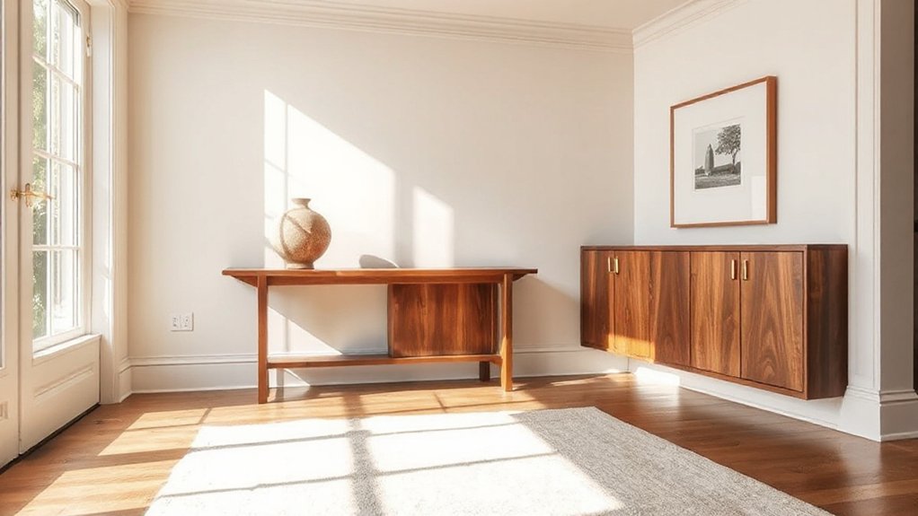
Why do some rooms feel complete and compelling while others fall strangely flat, even with beautiful furniture and finishes? The answer lies in intentional finishing touches. You move from a well-decorated space to a designed space when every element contributes to a cohesive narrative.
Furnishing accessories—textiles, art, objects, mirrors—act as punctuation, clarifying the room’s function and mood.
You use color accentuation to guide the eye: repeating a hue from a patterned rug in a vase, a throw, or a framed print. This creates visual rhythm and prevents the scheme from looking random.
Thoughtful layering of scale, proportion, and texture in these details ensures the architecture and major pieces don’t just occupy the room; they’re resolved, curated, and visually satisfying.
Using Lighting as the Ultimate Finishing Touch
How does a room shift from merely well-decorated to truly atmospheric? You achieve it by treating lighting as a deliberate design layer, not an afterthought. Begin by defining an ambient glow that flatters surfaces and softens architectural lines; this is your visual foundation. Use dimmable, warm-temperature bulbs to maintain consistency across spaces.
Next, deploy accent illumination to direct the eye. Highlight art, textured walls, shelving, or architectural niches with narrow-beam fixtures or thoughtfully placed picture lights. Balance these with discreet floor lamps or sconces that sculpt shadows rather than flatten them.
Finally, consider how light reads at different times of day. Test scenes at night: adjust angles, intensity, and spread until every sightline feels intentional and quietly dramatic.
Hardware Details That Instantly Elevate Interior Work
You can transform ordinary joinery into a design feature by treating hardware as jewelry for your interior. When you specify statement door handles, coordinated cabinet hardware, and high-impact hinges and latches, you create a cohesive visual language that feels intentional and elevated.
Focus on proportion, finish, and tactile quality so every touchpoint reinforces the overall design narrative.
Statement Door Handles
Ever noticed how a single, beautifully designed door handle can signal the quality of an entire interior? Statement door handles operate as jewelry for your doors, setting the tone before a space even unfolds. When you invest in decorative door hardware, you telegraph your design intent at eye and hand level.
You should consider scale, profile, and finish with the same rigor you apply to lighting or furniture. A solid, weighty lever in brushed brass instantly feels luxurious; a sharply profiled matte black pull reads contemporary and architectural.
Align the handle’s geometry with your interior language—softly rounded for organic schemes, crisp and linear for minimalist spaces. By treating handles as focal points, you transform a functional necessity into a deliberate design moment.
Coordinated Cabinet Hardware
Doors set the stage, but cabinet hardware carries that design language through every inch of joinery. When you coordinate knobs, pulls, and backplates, you create a continuous visual rhythm that instantly elevates built‑ins, kitchens, and wardrobes.
Hardware coordination isn’t about matching everything; it’s about curating a family of forms, finishes, and proportions that speak the same language.
Start with your custom cabinet finishes. Let the undertones dictate whether you choose warm brass, cool nickel, or a deep bronze.
Then refine scale: substantial pulls for tall pantry doors, slimmer profiles for drawers, discreet edge pulls for minimal fronts.
Align centers, sightlines, and projection depths so hardware feels intentional to the millimeter.
The result is a unified, high‑caliber interior envelope.
High-Impact Hinges And Latches
Although they’re often treated as purely technical components, hinges and latches are some of the most expressive hardware details you can specify. When you choose durable hinges in a finish that aligns with your cabinet pulls, you create visual continuity every time a door swings open.
Look for solid brass, stainless, or architectural bronze with high-quality bearings so doors feel substantial, not flimsy.
Decorative latches add a deliberate, crafted note to built-ins, wardrobes, and interior doors. A well-scaled latch can emphasize symmetry on panelled fronts or introduce contrast on minimalist joinery.
Keep sightlines in mind: align hinge knuckles and latch backplates with rails and stiles so the hardware reinforces your millwork geometry and quietly elevates the entire room.
Layered Textiles That Add Warmth and Dimension
When you layer textiles with intention, a space instantly feels richer, warmer, and more considered. You’re not just adding softness; you’re orchestrating textile textures to control mood, depth, and visual rhythm.
Start with foundational pieces—upholstery, rugs, and drapery—in resilient, tactile weaves. Then introduce fabric layering through throws, cushions, and bedcovers that contrast matte with sheen, coarse with smooth, tight with open weave.
Maintain a tight palette but vary tone and texture to avoid flatness. A wool boucle sofa, linen cushions, and a velvet throw read cohesive yet dimensional.
Use larger-scale textures on main surfaces and finer ones for accents, so the eye steps gradually through the room. This hierarchy keeps the composition deliberate, not cluttered.
Styling Surfaces: Coffee Tables, Consoles, and Shelving
Handled well, styled surfaces turn coffee tables, consoles, and shelving into deliberate compositions rather than catchall clutter. Start by defining a clear hierarchy: one dominant piece, a supporting element, then smaller accents. Vary height, scale, and visual weight so the eye moves in a measured rhythm across each surface.
Layer in fabrics and textures to soften hard planes—think a linen runner on a console or a small woven mat under a tray. Use trays to corral decorative accessories, creating order and easy negative space.
Mix materials intentionally: metal with wood, glass with stone, matte with gloss. On shelving, combine stacked books, sculptural objects, and controlled breathing room, repeating finishes and tones to unify every surface within the room.
Wall Art, Mirrors, and Decor That Tie a Room Together
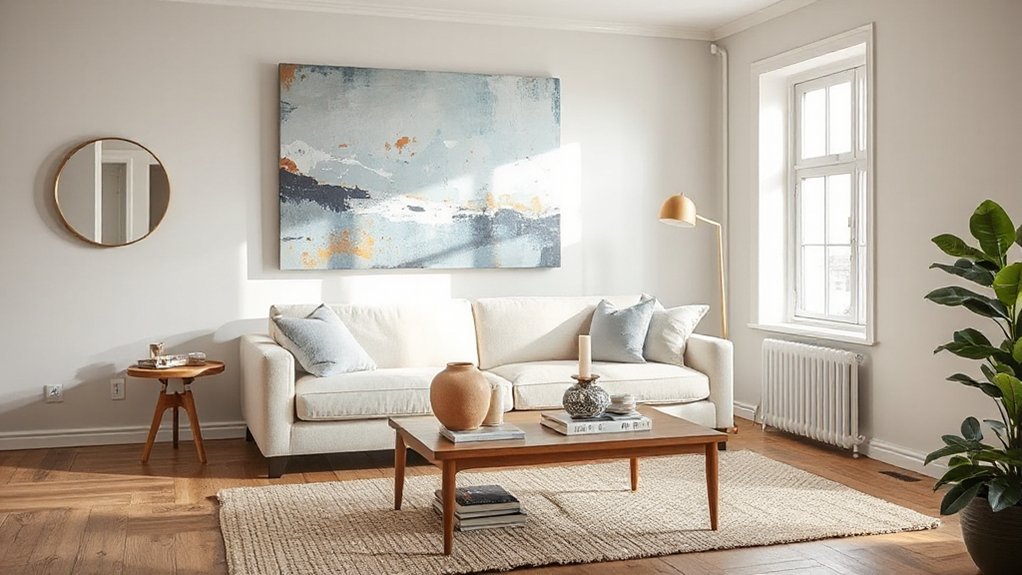
When you treat your walls as curated canvases, you transform a finished room into a cohesive, intentional space. You’ll select art that anchors your palette, balances scale, and establishes a clear focal point, rather than filling gaps by default.
Then you’ll position mirrors with precision—controlling light, sightlines, and proportions—to visually expand the room and reinforce your design narrative.
Choosing Impactful Wall Art
How do you choose wall decor that does more than just fill empty space? Start by defining the mood: calm, dramatic, or energetic. Then narrow your wall art styles accordingly—minimalist line drawings, bold abstracts, graphic photography, or curated gallery walls.
Prioritize pieces that echo your room’s proportion, color palette, and architectural lines.
Treat impactful wall decor as part of the room’s visual architecture. Scale artwork to the wall and furniture: roughly two-thirds the width of the piece it hangs above. Align frames so sightlines feel deliberate, not accidental.
Repeat key hues from textiles or finishes to create cohesion. Finally, mix mediums—canvas, textile hangings, sculptural pieces—to add depth, and invest in framing that visually “finishes” each work.
Using Mirrors Strategically
Used thoughtfully, mirrors act as precision tools, not decorative afterthoughts, shaping light, views, and spatial perception in a room. You start by defining what you want to amplify: natural light, a focal feature, or a sense of depth. Then you plan mirror placement with the same rigor you’d apply to windows.
Position large mirrors perpendicular to windows, not directly opposite, to bounce daylight across the room without glare. Align the mirror’s center with average eye level to maintain visual balance.
Treat reflective surfaces as compositional elements: frame architectural details, extend sightlines down a hallway, or double the impact of a strong piece of wall art. Avoid reflecting clutter or blank ceilings—whatever the mirror sees, the room experiences twice.
Color, Pattern, and Materials as Subtle Finishing Layers
Although layout and furniture establish the framework of a room, it’s the calibrated use of color, pattern, and materials that delivers the quiet, refined layers of a truly finished interior.
You start by applying color psychology: muted, cool tones recede and calm; warmer, desaturated hues advance and energize. Limit your palette to two or three main tones, then repeat them across textiles, wall finishes, and trim for cohesion.
Treat pattern mixing like a controlled equation. Vary scale—one bold, one medium, one subtle—and keep a common hue linking them. Balance organic motifs with tailored geometrics.
Finally, edit your material palette: pair matte with gloss, smooth with textured, warm woods with cool metals, ensuring each finish supports the room’s overall narrative.
Personal Touches That Make Interiors Feel Lived-In

Once the color, pattern, and material story is in place, the room still needs evidence of the life lived within it. You create that through purposeful personal layers: framed snapshots in restrained grids, a stack of dog‑eared books on a side table, a ceramic bowl that always holds your keys.
Curate garden accents inside too—terracotta pots, a single sculptural branch, or a bowl of citrus—to imply daily rituals and seasonal change. Let window treatments support this narrative: linen panels that pool slightly on the floor, a tailored Roman shade revealing a windowsill herb tray, or sheers that soften daylight onto a reading chair.
These details don’t clutter; they signal your habits, history, and priorities.
Common Finishing Touch Mistakes and How to Avoid Them
Even the most cohesive interiors can falter at the finishing stage, when small missteps in scale, placement, or quantity undermine all the work that came before. You often see art hung too high, cushions in arbitrary numbers, or accessories scattered without hierarchy.
To correct this, align artwork at eye level, group objects in odd numbers, and establish one clear focal point per zone.
Don’t crowd surfaces; negative space is essential, especially with minimalist aesthetics. Edit ruthlessly, then reintroduce only what strengthens proportion, texture, or color.
Avoid trend-chasing accessories that clash with your core palette or ignore sustainable materials. Instead, specify enduring finishes—solid wood, natural fibers, recycled glass—and repeat them across the room so every finishing touch feels intentional, cohesive, and quietly elevated.
Frequently Asked Questions
How Do Finishing Touches Differ Between Rentals and Owned Homes?
You treat rentals as reversible stages: rely on removable wall art, portable decorative accents, and textiles. In owned homes, you commit: integrate custom millwork, gallery-hung art, hardwired lighting, and tailored finishes that permanently anchor your aesthetic vision.
What Finishing Touches Increase Resale Value the Most?
You boost resale value most with cohesive lighting upgrades, luxury fixtures, fresh neutral paint, refined hardware, and large statement art anchoring key walls, like a gallery reveal; you’re selling aspiration, not shelter, so prioritize tactile, visible quality.
How Can I Prioritize Finishing Touches on a Tight Budget?
You prioritize by targeting high-impact zones first: entry, living, kitchen. Use budget friendly decor, crisp paint, upgraded hardware, and layered lighting. Apply DIY finishing tips—caulk gaps, refresh trim, align artwork—to create a cohesive, elevated look affordably.
Which Eco-Friendly Finishing Touches Make the Biggest Visual Impact?
You’ll see the biggest impact from eco friendly paints in rich, matte hues—think of walls as your canvas—and layered Recycled decor like glass vases, metal frames, and reclaimed-wood accents that add texture, depth, and narrative.
How Often Should I Update Finishing Touches to Keep Spaces Feeling Current?
You should refresh finishing touches every 12–18 months. Rotate decorative accents seasonally, but reassess major color accents annually. Update cushions, art, and styling vignettes; keep core furniture timeless so small, strategic tweaks always feel current.
Conclusion
When you edit a room like a final manuscript, every finishing touch becomes your signature. You’re not just placing lamps and textiles; you’re directing light, framing views, and orchestrating contrast. Let your hardware feel deliberate, your layers intentional, your personal pieces curated, not cluttered. In the end, you’re Gatsby adjusting the last glass on the tray—quietly, obsessively—because you know visitors won’t see the work, only the effortless, unforgettable atmosphere.