
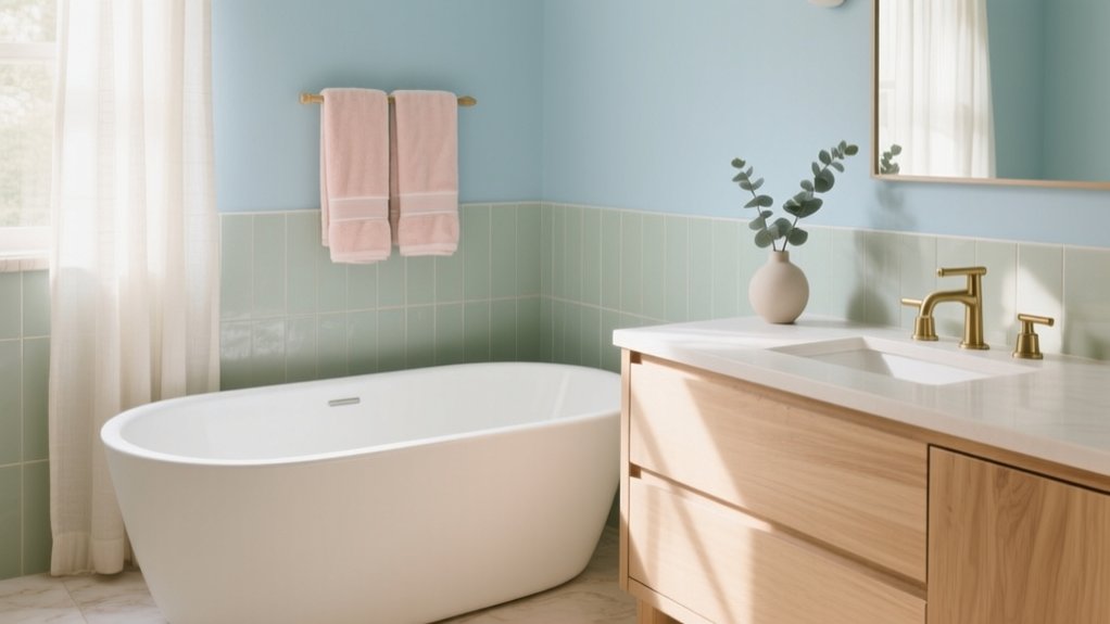

You can create a relaxing bathroom with five soft, UK-friendly palettes: cream with taupe accents for gentle warmth; warm greys with greige-leaning tiles and brushed metals for quiet structure; sage green with honed limestone and aged brass for a spa mood; soft blue with crisp white tile and pale grout for calm clarity; and blush pink balanced by warm whites, pale oak, and brass for subtle elegance. Continue for practical pairings, finishes, and lighting guidance.
Key Takeaways
- Cream and taupe create a warm, restorative bathroom; use soft off-whites and understated taupes for a calm, UK-friendly finish.
- Warm greys with greige undertones feel soothing; pair mid-grey porcelain tiles with brushed nickel or aged brass to avoid harsh shine.
- Sage green walls or cabinetry deliver spa serenity; balance with honed limestone or warm stone-effect porcelain and crisp, minimal grout lines.
- Soft blue paint with white tiles gives a coastal calm; keep grout pale and choose low-sheen, water-resistant paint above splash zones.
- Blush pink works best as a subtle accent; anchor with warm whites, pale oak or limestone, and brass details for a relaxed boutique feel.
Warm Neutral Bathroom Colours: Cream + Taupe Pairings

Although cool whites can feel crisp, a cream-and-taupe scheme brings a softer, more restorative warmth to a bathroom. You’ll achieve balance by placing cream on larger planes—ceiling and primary walls—then introducing taupe on niches, panelling, or the vanity surround to anchor the room. Choose understated, UK-appropriate undertones: creamy off-whites with a hint of stone, and taupes leaning neither pink nor muddy. Use Soothing paint techniques such as a subtle limewash effect or softly layered matte coats to blur edges and reduce visual noise. For natural lighting enhancements, keep window dressings minimal, specify lighter trim to bounce daylight, and position mirrors to return illumination across the cream field, keeping the space calm yet considered.
Warm-Grey Bathroom Palette: Tile and Metal Finishes
If cream-and-taupe feels softly sunlit, a warm-grey palette delivers the same restorative ease with a cleaner, more architectural edge. You’ll get the best result by choosing mid-grey porcelain tiles with a slight greige undertone, then keeping grout lines fine and consistent for a calmer read. Pair them with brushed nickel or satin stainless taps, or go softer with aged brass if you want warmth without glare.
Use one statement surface: a ribbed tile splashback, micro-cement effect panel, or other textured wall accents to add depth without busy pattern. Layer your lighting deliberately—low-glare downlights for clarity, plus mood lighting behind a mirror or within a niche to soften shadows. Finish with warm-white lamps (around 2700–3000K) so grey stays welcoming in UK daylight.
Sage Green Bathroom Palette: Spa-Style Paint + Stone
When you want a palette that reads calm yet considered, sage green delivers a spa-like softness without losing definition. Use it on walls or cabinetry to temper hard surfaces and sharpen joinery lines. Choose sustainable paint options with low-VOC formulas from UK makers, so the room feels fresher as well as quieter.
Pair the colour with honed limestone, pale travertine, or stone-effect porcelain in warm neutrals; keep veining subtle to avoid visual noise. Add brushed nickel or aged brass for restrained warmth, then introduce eco friendly bathroom decor through FSC-certified oak stools, recycled-glass dispensers, and organic cotton towels. If you’re short on daylight, pick a greyed sage and uplift it with matte off-white ceilings and crisp, considered grout lines.
Soft Blue Bathroom Palette: Calming Walls With White Tile

Because soft blue sits comfortably between coastal ease and classic tailoring, it brings a calm, architectural clarity to a bathroom without flattening the space. You’ll get the best result by pairing it with crisp white tile: metro or slimline porcelain keeps the scheme disciplined, while pale grout maintains brightness under typical UK daylight. Specify Water resistant paint in a matte or soft eggshell for walls above splash zones, and keep sheen low so the colour reads serene, not sugary. Use white sanitaryware to sharpen contrasts and let the blue do the atmospheric work. For Light fixture options, choose opal globe wall lights either side of a mirror for even, flattering illumination, or a discreet IP-rated downlight to avoid glare. Add minimal chrome.
Blush Pink Bathroom Palette: Warm Whites and Brass Accents
Blush pink offers a softer warmth than pale blue, lending a bathroom a gently flattering cast that still feels composed. You’ll get the best result by pairing it with warm whites: think ivory paint, off-white zellige, or cream-veined stone that won’t read clinical under British daylight. Keep the base quiet, then introduce blush pink accents through towels, a painted vanity, or a framed print to avoid an overly sweet scheme.
Specify brass fixtures to bring definition and a considered, boutique-hotel finish. A brushed or aged brass tap, shower trim, and mirror frame will sit comfortably against warm white surfaces, while also lifting pink’s undertone. Ground the palette with pale oak or honed limestone, and choose opal lighting so everything reads serene, not saccharine.
Frequently Asked Questions
What Paint Finish Is Best for Bathroom Humidity: Matte, Eggshell, or Satin?
Choose satin for bathroom humidity; you’ll get durable, wipeable, moisture resistant finishes. Use eggshell in well-ventilated cloakrooms for a softer look. Avoid matte unless it’s specialist bathroom-grade. These paint sheen options suit UK interiors best.
How Do I Prevent Mould and Mildew When Using Soft Colour Palettes?
To prevent mould and mildew, you’ll treat moisture like an uninvited guest: expel it. Use ventilation strategies—quiet extractor, trickle vents, opened windows—then specify mould resistant paints, seal grout, and wipe condensation promptly.
Which Lighting Temperature Makes Pastel Bathrooms Look Most Natural?
Choose 3000–3500K warm-neutral LEDs; they’ll render pastels most naturally in UK bathrooms. You’ll balance lighting tones with daylight, achieving natural illumination without yellowing or flattening. Pair with high-CRI lamps and dimmers.
Can I Use Peel-And-Stick Wallpaper in a Steamy Bathroom?
Yes, you can, like a calm spa breeze settling your nerves. Choose vinyl for peel and stick durability, add extractor ventilation, and follow wallpaper adhesive considerations: prep, prime, avoid splash zones, and seal edges.
How Can I Make a Small Bathroom Feel Brighter Without Changing Tile?
You can make a small bathroom brighter by adding layered lighting, fitting a larger mirror, and using high Color contrast towels and decorative accents. Choose gloss paint, clear shower screens, and declutter surfaces to boost reflectance.
Conclusion
With these soft palettes, you’ll shape a bathroom that feels composed, modern, and quietly restorative—whether you lean towards cream and taupe, warm greys, sage, soft blues, or blush with brass. Keep finishes cohesive, and let colour do the calming. Remarkably, UK research shows blue is the nation’s most preferred colour, chosen by around 45% of people—so a soft blue scheme can feel instantly familiar and soothing, without sacrificing design intent.